CASE STUDY COMING SOON. PLEASE STAY TUNED!
At its core, Vytality Health is a “co-caring” social community app that provides reliable, authentic support while improving well being and positive healthy social behaviors. How does it do this?
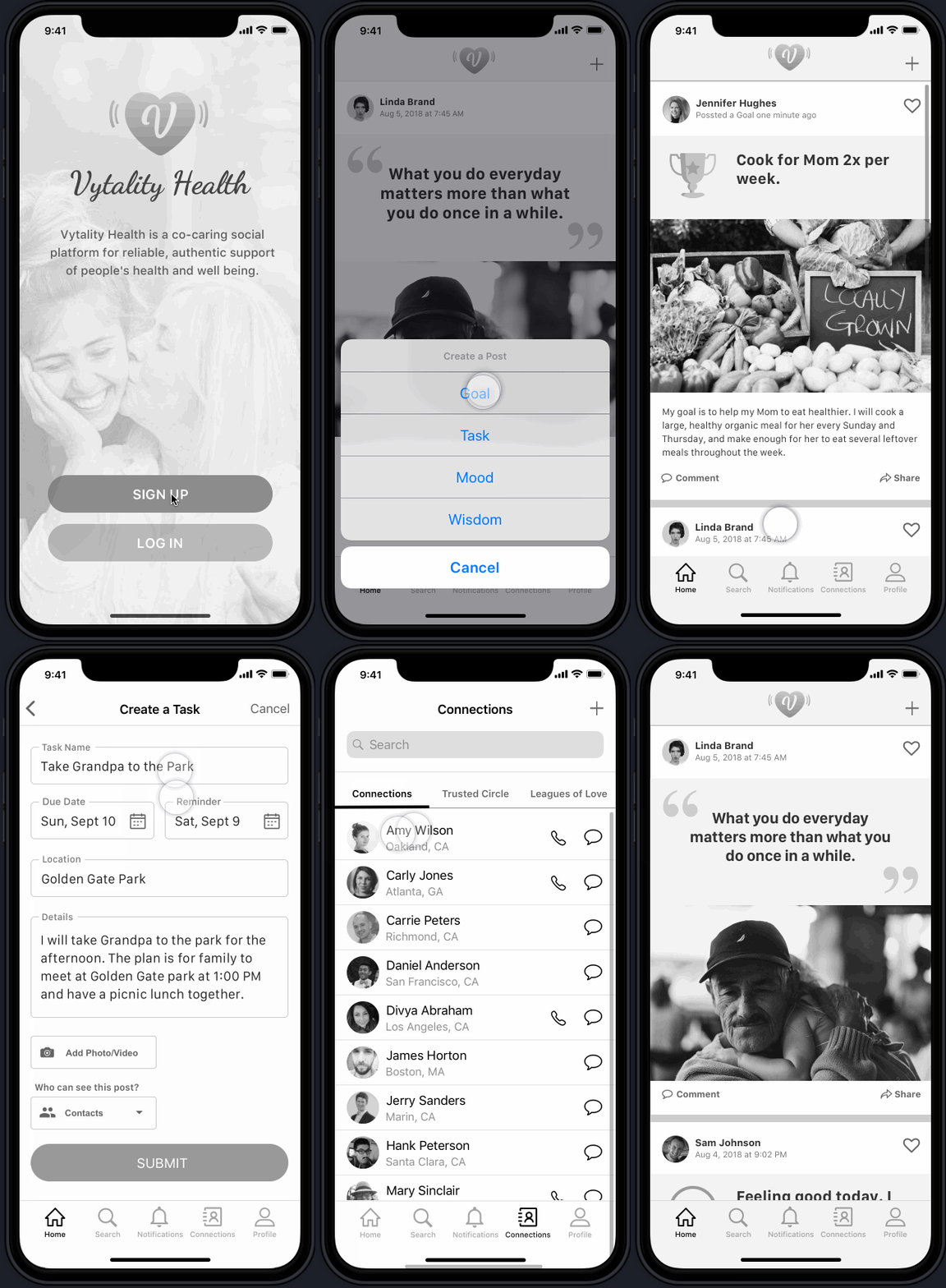
By posting a goal, task, mood or wisdom note that appears on friends’ timelines which encourages engagement, creates a sense of belonging, and provides emotional and physical support
Every post type brings a unique experience to the individual in need, e.g. when creating a goal “read 20 books by the end of this year,” the user is able to set a reminder, and control the privacy of the post- Vytality Health encourages users to post goals publicly as the trusted social community provides accountability and support in achieving goals.
PROJECT DETAILS
My Title: UX/UI Designer & Project Manager
Team: 3 UX Designers and 1 UX Designer & Project Manager
My role: Project management; Defining target users; Interviewing users and sending out surveys for qualitative and quantitative data, respectively; Creating personas; Sketching, and building wireframes for Onboarding, Homepage/Feed, and Messages; Rapidly prototyping; Conducting usability testing; and Iterating multiple times
Tools: Pen, Markers, Paper, Whiteboard, Sticky notes, SurveyMonkey, Sketch, Invision, Licecap, and Trello
DESIGN CHALLENGES
Vytality Health wanted us to:
1) Conduct user validation research
2) Build the foundation on how people support their own and other's goals.
We followed the Standford d.school Design Thinking throughout the design process
Timeline from Research to Client Presentation
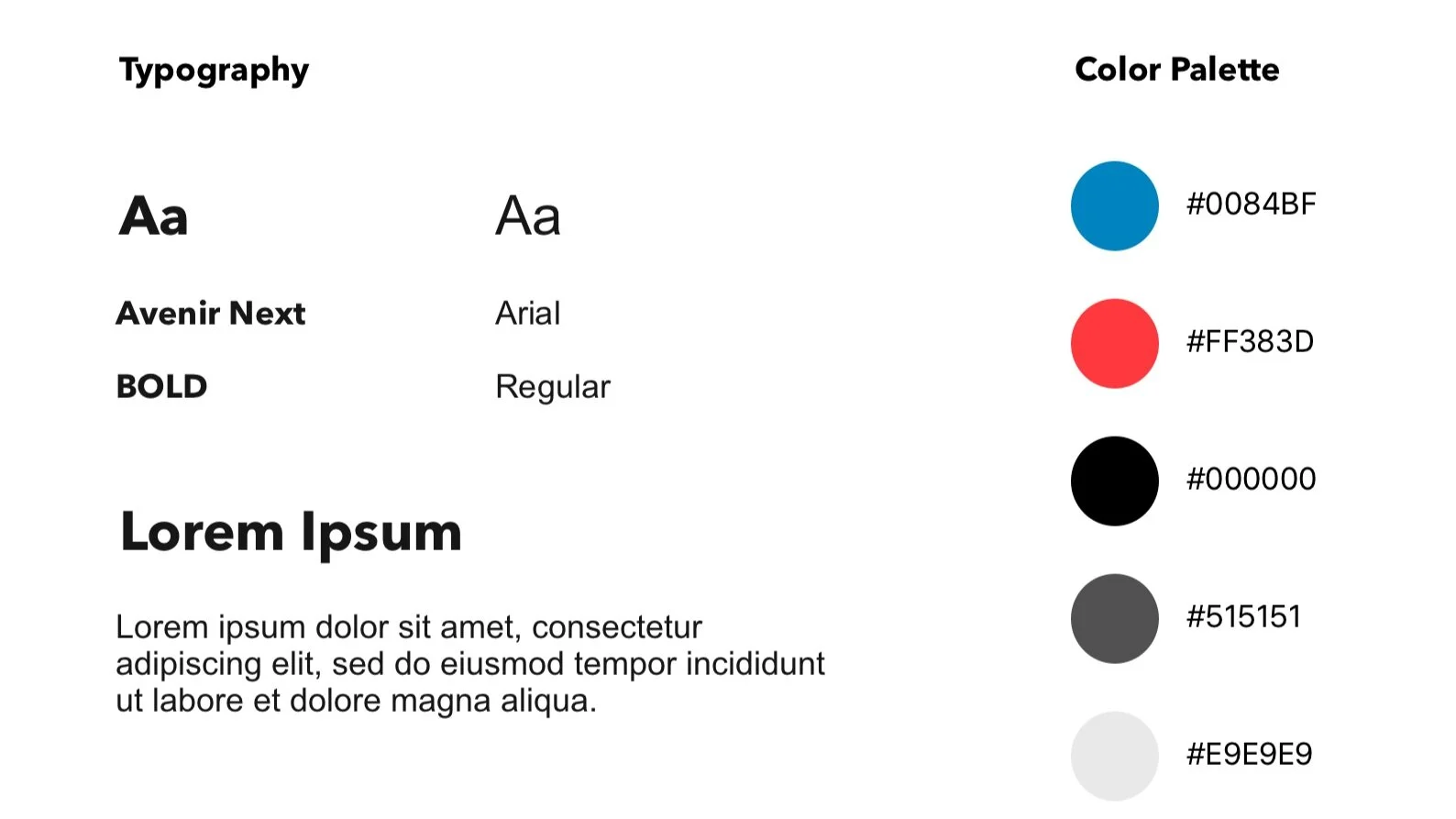
STYLE GUIDE
Who are the competitors?
To get a better understanding of what is already out there in terms of caring apps, we turned to our competitors and analyzed their features. We looked into Lotsa Helping Hands, Carely, Kinto and Caregivers in the Community.
Most apps focus on medications, and other daily health tracking OR coordinating and helping organize daily caregiving tasks.
Most common features: Profile, Contact Management, Closed Group management, Commenting, and Task Management.
Opportunities:
Community engagement in this space is lacking.
Gamification is not typical of this app space. If you can incorporate it smartly, it will greatly help engagement.
Keeping in mind that this app is a social community app, we compared features from other social apps to get an idea of what features would enhance the social community experience for our users. We looked into Instagram, Facebook, OkCupid, and Rover.
Newsfeed with images, statuses, quotes, and more
Explore function that matches you with profiles/posts of interest
Profile completed by self-descriptions and preferences
Opportunities:
Many use the function of sharing but enjoy the privacy as well
An engaging feed on homepage keeps users interested
USER INTERVIEWS & FINDINGS
Our client provided us with a list of people we could interview but the target user type was too general. After conducting a total of 13 in-depth user interviews and 7 surveys (for both quantitative and qualitative data), we were able to put the target users in two categories: Caregivers and Care-receivers.
“I’d love emotional support from others whether they’re friends or strangers - when I’m feeling sick, emotional support is 100% helpful.”
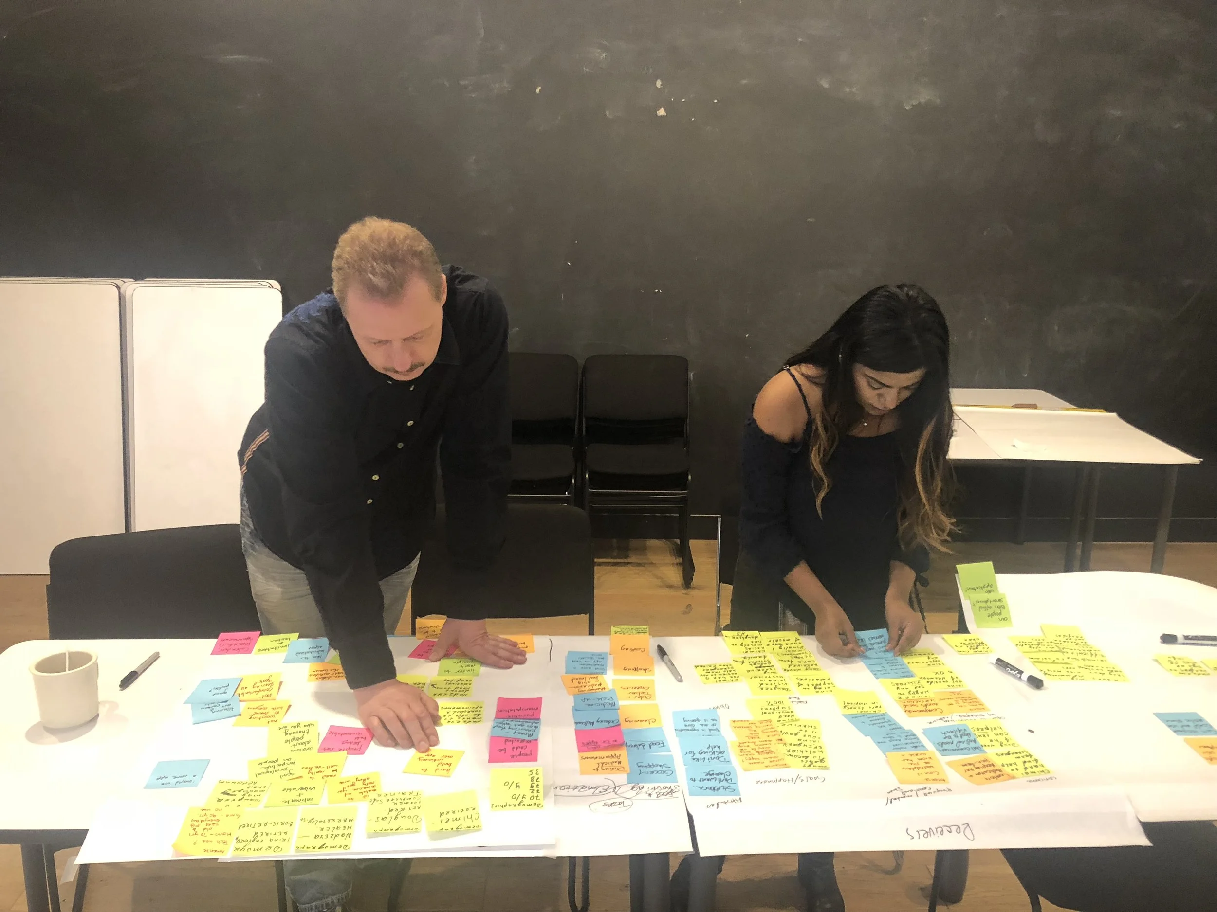
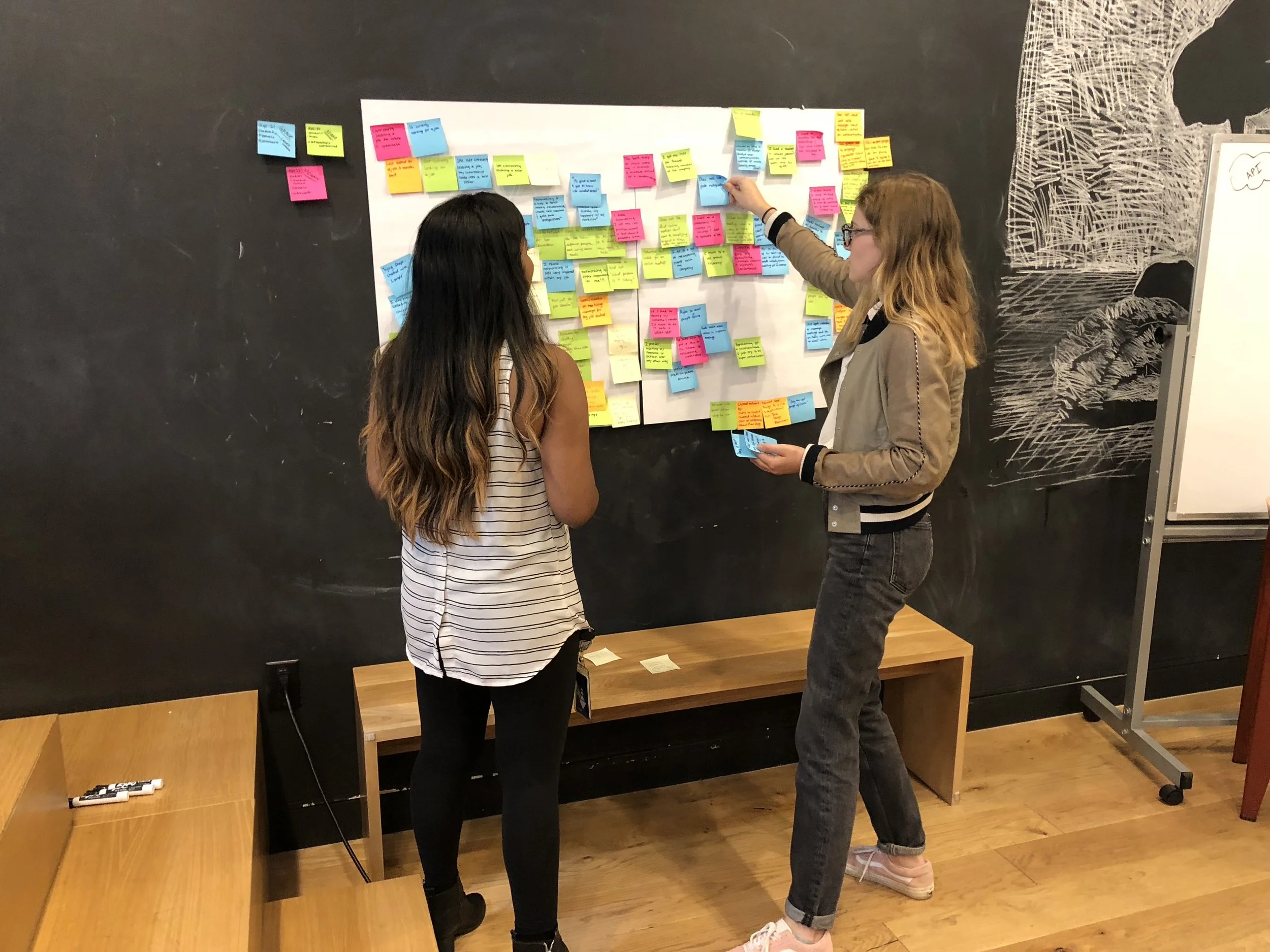
Once all the data was gathered, we proceeded to affinity map to uncover the patterns and trends from our users. We were finally able to discover their pain points, challenges and delights.
PERSONAS
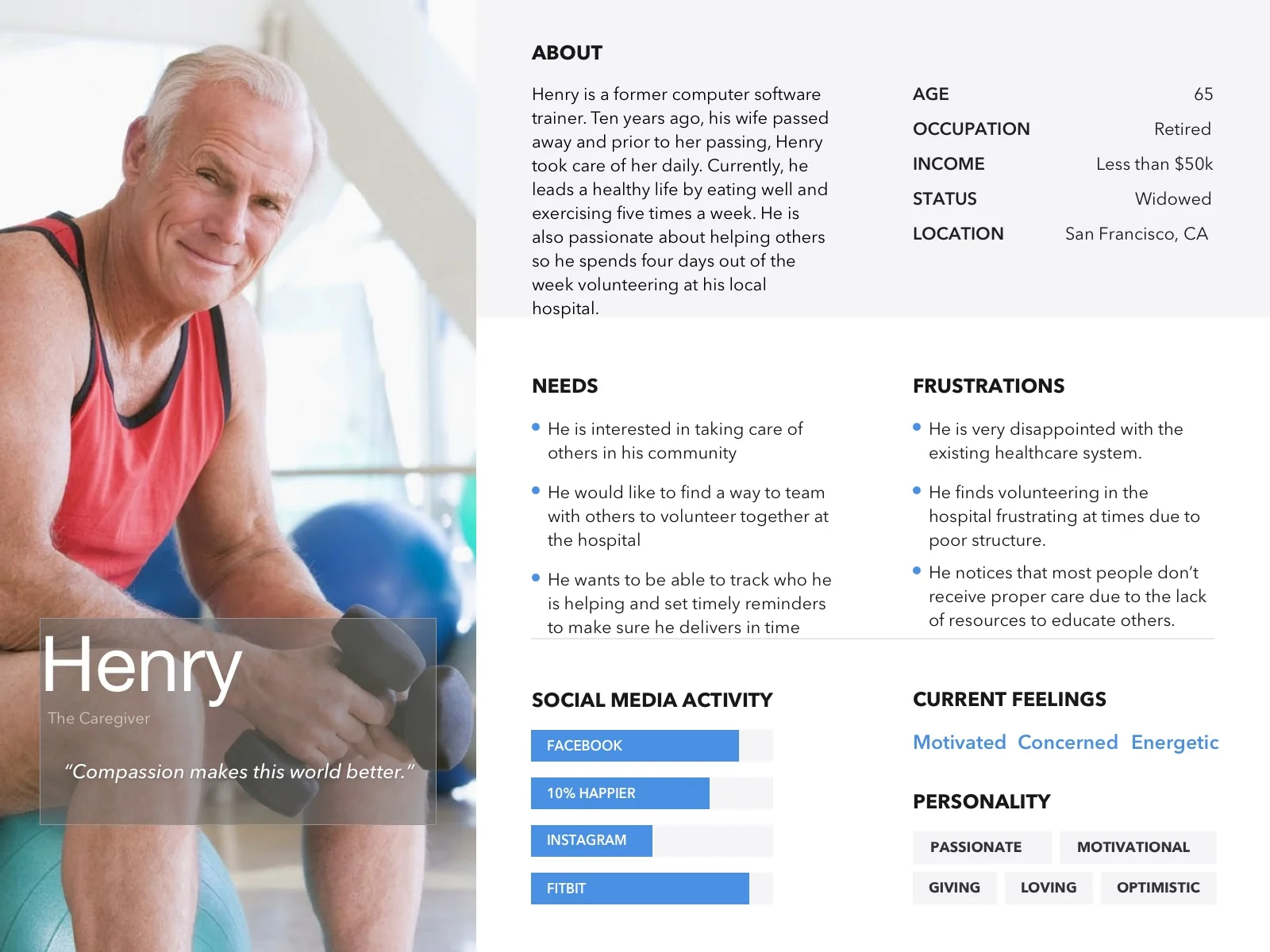
Once we gathered these insights into what our users felt about caregiving and care-receiving, I was able to create three personas for the target audience. Our primary persona is Henry who is the caregiver, the second is Omari who is the care-receiver, and third is Jennifer who is both the caregiver and care-receiver. The unique story and background of all three personas are a direct reflection of the users we interviewed and surveyed.
PROBLEM
People who need care are not aware of apps that can help them with their needs while providing a community to engage with others. While, people who would like to help are also not aware of apps that provide a community and list of people who need care.
SOLUTION
Design a simple yet engaging app for caregivers & care receivers that will use a matching system to match with each other for their respective needs.
SKETCHES
Before diving deep into Sketch to begin wireframing, we decided to brainstorm ideas on different user flows and sketch out some ideas. The user flows we focused on were: Creating a post, messaging a match and sending a reaction. After consulting with our client, we decided it was best to focus on the first two user flows and scrap the idea of adding reactions. Additionally, considering multiple ways to accomplish the same task, we also looked into creating another version of the user flow of messaging-a-match to test with our users.
Another version of the Flow 2: Messages
WIREFRAMES
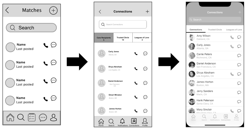
Even though our scope of project was to deliver either low fidelity or medium fidelity wireframes, we went above and beyond by producing a high fidelity wireframe as well as a visual composition. The low and medium fidelity wireframes went through multiple rounds of testing through each user flow.
The wireframe development progression on the Onboarding page
The wireframe development progression on the Home/Feed page
The wireframe development progression on Creating a post
The wireframe development progression on Connections/Messaging
The visual composition for Onboarding, Home/Feed, Post, and Connections/Messaging
ITERATIONS
Iterations are never simple as they require a great length of detail and are often the “meaty” part of the UX Design process, however, they are the most useful when explaining design decisions. Below are some of the major iterations that I noted throughout our journey.
Any noticeable progression through wireframes should and must always be explained through usability testing. Why? It’s all about the users satisfaction. We had 13 users test out our prototypes and asked them to express their thoughts during the process. While we jotted down their vocal thoughts, we paid particular attention on their body language as well to notice signs of delight, confusion, surprise, and so forth. The usability testing proved successful in all rounds and I was able to explain our iterations to our client with rock-solid and detailed evidence (see below the Iterations).
Our final prototype to our client was the high fidelity prototype, not the visual composition. Access below the InVision link to test out the prototype yourself!
“Thank you so much for your dedication, perseverance, and hard work...no words can describe the exceptional job you guys have done and the amount of empathy towards your craft.”
Each and every step of the way, we encountered many “aha” moments and made sure to convey them to our client. Below is a list of those “aha” moments turned into next steps that involve innovative and fun additions for Vytality Health:
Develop the care-receivers profile and their user flows to see their journey
Because many care-receivers are not tech-savvy, we recommended creating an option for caregivers to manage profiles of care-receivers with their permission
Create an accessible version of interface for users that need larger text to read, microphone ability in each flow that involves writing, and more
Have Vytality Health provide a Certification of Trust to caregivers to be “verified” for care-giving
Build a Matching system on: location, profile details, time of availability, and types of posts made over time
Add a feature on the home/feed page that would let the user filter what kind of posts he/she wants to see and from who vs. seeing all public posts
Within settings for editing profile, create a lock feature which lets user lock private information that he/she would not like to share with everyone (e.g.: age, location, etc.)
Caregivers receive “care points/hearts” for each time they complete a task for their care-receivers and this puts them at the “top” of list to be a caregiver
In 16 days, my team and I were able to accomplish a lot more than we imagined as we ran through the UX design cycle. Our client was absolutely delighted with our work and excited to ship our design for the December 2018 MVP launch.
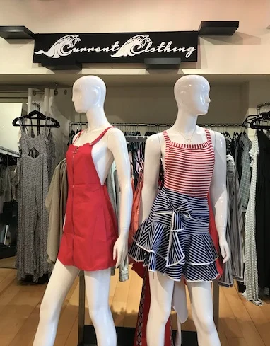
Current Clothing is a local SF contemporary clothing boutique located in the Marina district of San Francisco, California. Founded in 2014, this boutique mainly advertises its many products through their Instagram handle and keeps a low-profile on their official website. Unfortunately, the lack of attention on their site shows through: unclear navigation bar, cluttered homepage, lack of filters for products, no promotions/sales content, and many more.
PROJECT DETAILS
My Role: UX/UI Designer
Team: Solo Project
Tools: Paper, Pen, Flipcharts, Whiteboard, Sticky Notes, Sketch, InVision
Design challenge
Redesign an e-commerce site of a local boutique in San Francisco, CA.
STYLE GUIDE
WHO ARE THE COMPETITORS?
The Current Clothing boutique prides itself by keeping their store open later than other boutiques in the neighborhood. However, staying open for a longer time is not enough when competing online.
To see what strategies other contemporary e-commerce sites were taking to showcase their products, I looked into Gap and Urban Outfitters.
Both GAP and Urban Outfitters have:
Minimalistic design
Visible and highlighted brand logo
Loves List
USER INTERVIEWS & FINDINGS
Inside Current Clothing boutique
To get a better understanding of the boutique’s culture and store presence, I went to take a look inside in hopes of meeting the owner/manager and speak to some shoppers. To my delight, I found a bright-eyed woman behind the cash register who introduced herself as Bailey, the store manager and a few shoppers browsing the store. I proceeded to speak with and observe Bailey and the other shoppers during my hour long visit.
User Interview & Contextual Inquiry findings:
Demographics are 95% women
Most shoppers are local to the neighborhood
More traffic in the store around evening
Less than half the people leave the store with a purchase
Many women come in for wedding-guest dresses as well as music festival wear
PERSONAS
Interviewing the shoppers and managers gave me a clear vision on what type of users shop at Current Clothing. See below their profile but pay special attention to Lauren Rohde who is the main and primary persona- she’s in her 30s, successful in her career and lives in the same neighborhood as the boutique.
PROBLEM
Users find themselves frustrated and wasting time because they are unable to find clothes in their size and price range because of the lack of basic filter features to narrow down the product options.
SOLUTION
This redesign will now enable users to add a filter to their searches which will decrease frustration and time spent to find a desired product. This will, in turn, grow more sales for the company.
INFORMATION ARCHITECTURE
As mentioned above, I compared Current Clothing’s IA for the navigation bar with two other contemporary clothing e-commerce sites: GAP and URBAN OUTFITTERS.
CURRENT CLOTHING
GAP
URBAN OUTFITTERS
Both GAP and Urban Outfitters have:
Clear Navigation Bar with dropdown features for each category
Clear Search Bar
Visible and highlighted brand logo
CARD SORTING
After comparing the competitors sitemap with Current Clothing, it was apparent that the latter needed a redesign to effectively guide users in navigating through different types of clothing items.
SITEMAP
The card sorting resulted in adding a drop down menu for each category contrary to the original sitemap. See below for the difference:
OLD SITEMAP
NEW SITEMAP
SKETCHES & WIREFRAMES
Before digitizing my ideas, I hand-sketched the redesign for Current Clothing’s homepage and then moved on to building low fidelity wireframes and high fidelity wireframes. See below the comparison between the original site and the (select) redesigned pages:
Hand sketch for homepage
Block wireframe for homepage
comparison between Original and Redesign
HOMEPAGE
Redesign: Lo-fidelity wireframe for Homepage (Tops dropdown in view)
Redesign: Hi-fidelity wireframe for Homepage (Tops dropdown in view)
PRODUCTS PAGE
Redesign: Lo-fidelity wireframe for Products page
Redesign: Hi-fidelity wireframe for Products page
ITERATIONS
As users gave their feedback, I iterated multiple times. See below for some of the iterations for homepage; shipping, billing, & payment; and account login page.
HOMEPAGE
Shipping, Billing & Payment Page
ACCOUNT LOGIN PAGE
Continuous usability testing produced some thoughtful feedback and suggestions on improvement. Starting from the hand sketch to the high fidelity prototypes, I had 7 users who participated in testing my redesign. Find Iterated screens under the Iterations section.
FINDINGS
On hand sketch
Instagram pictures are distracting and not necessary
“How can we help you” can be removed to avoid overcrowding on the footer
Add social media links near contact information
Lo/Hi-fidelity
For homepage
Remove “Browse” under Collections in Homepage as it leads to none of the categories - instead make each box clickable
For shipment page
Remove multiple submit buttons
Only show one tab during Shipment process (both screens open are confusing)
Account login page
Add a “exit” button to enable the user to exit out at any time
The final hi-fidelity prototype shows a clear user flow from product discovery to checkout. Another user flow that I briefly showed was how to log in to the user account but also promptly exiting to show it’s not necessary for purchasing.
Overall, this redesign has made me realize how important it is for e-commerce sites to appeal to their target audience. Being a small boutique means that many folks visited the store by being nearby or simply, chance- this meant for more of an in-store experience rather than an online one.
Next steps for this redesign would be to produce a visual composition of the high fidelity wireframes and find a Developer to code the redesign.
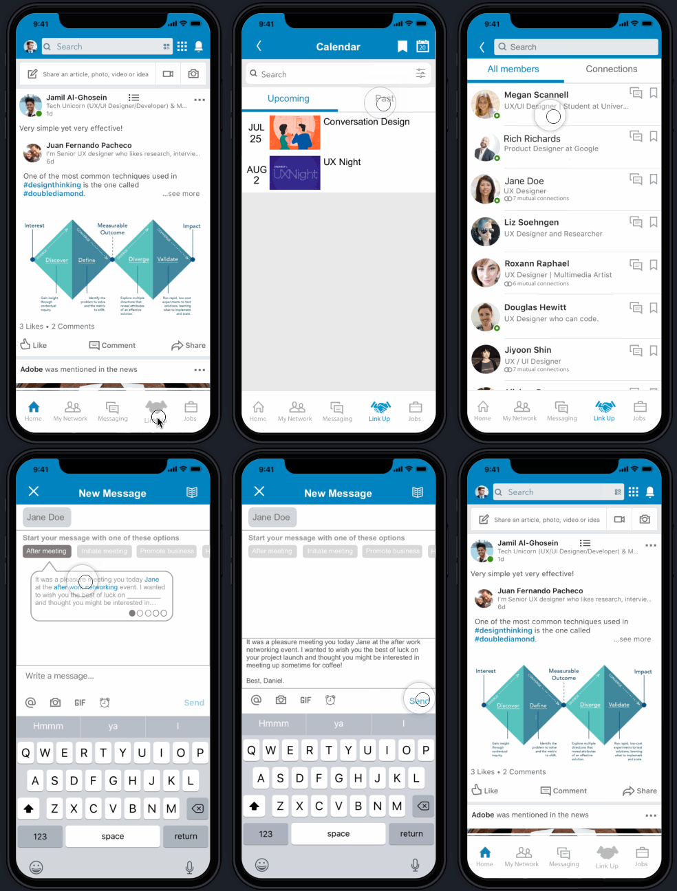
If you’ve ever attended a networking event, you probably found those events through Facebook, Meetup, Eventbrite or some other platform other than LinkedIn. Meeting professionals 1:1 is also relatively easy these days through Shapr and mutual connections. In all of this, where does LinkedIn come in? LinkedIn is one of the top contenders amongst Indeed, Glassdoor, and more when it comes to job searches with the benefit of connecting with other professionals. However, imagine a world where LinkedIn offered networking events and an efficient contact management as part of their services. Is that possible? Absolutely. This is what my team and I aimed to create through the addition of a new feature called Link Up that provides users with plenty of networking events, and an efficient contact management system to organize memorable data from events and networking with other professionals- all while having access to a plethora of jobs to apply to. Scroll below to see our process through design thinking, early to end stage wireframing, usability testing and interactive prototyping.
PROJECT DETAILS
My Title: UX/UI Designer & Project Manager
Team: 3 UX Designers, 1 UX Designer and Project Manager
My Role: Project management; Interviewing users and sending out surveys; Creating primary persona; Sketching; Building low fidelity/mid fidelity wireframes, Rapidly prototyping; Conducting usability testing; and Making iterations
Tools: Pen, Markers, Paper, Whiteboard, Sticky notes, SurveyMonkey, Sketch, Invision, Procreate, Licecap, and Trello
DESIGN CHALLENGEs
LinkedIn wants to increase user engagement by making the mobile app a one-stop destination for contact management and networking. Also, any design to key screens must use the current look and feel of the LinkedIn mobile app.
STYLE GUIDE
WHO ARE THE COMPETITORS?
As there are no apps that combine the ability to apply for jobs and sign up for networking events, we selected features that other apps used for comparison.
All the comparative apps had a profile, and networking feature
Two out of three of he comparative apps had an interests section, messages log, meet IRL (in real life) functionality, suggested connections feature, groups/orgs feature and a reminders feature
Opportunities:
Many use the function of networking, meeting IRL, groups/orgs, and reminder
Reminders feature seem to be a consistent feature in networking apps
USER INTERVIEWS
There were screen surveys sent out with 28 responses and 9 (1-2 hour) in-person interviews were conducted with individuals in the diverse age range of 20-48 years old.
What are our users saying?
“There’s a pressure to stand out at networking events.” (feelings about attending networking events)
“I prefer having 1:1 meetings or going to mixers vs phone or video calls.” (the preferred type of networking)
“I usually try to find a common ground or mention mutual connections.” (approaching someone at a professional event]
“I flag important emails, make notes and update my calendar regularly!” (organizing networking/professional notes)
Personas
To give our designs more meaning, we decided to bring these findings to life by instilling them into personas. The primary persona is Daniel, the ambitious networker, whom we will focus on the rest of this journey. The other two personas are Lynn- the nervous networker and Steve- the charismatic career coach , respectively.
PROBLEM
Users needs to network with individuals in their desired community but lack guidance in approaching the respective professionals and keeping proper organization skills.
SOLUTION
This new feature will now enable users to reach out to working professionals with guided prompts and organize their notes and bookmarks within Link Up.
STORYBOARD depicting Daniel's journey: From attending a networking event to connecting with a professional at said event and eventually landing his dream job
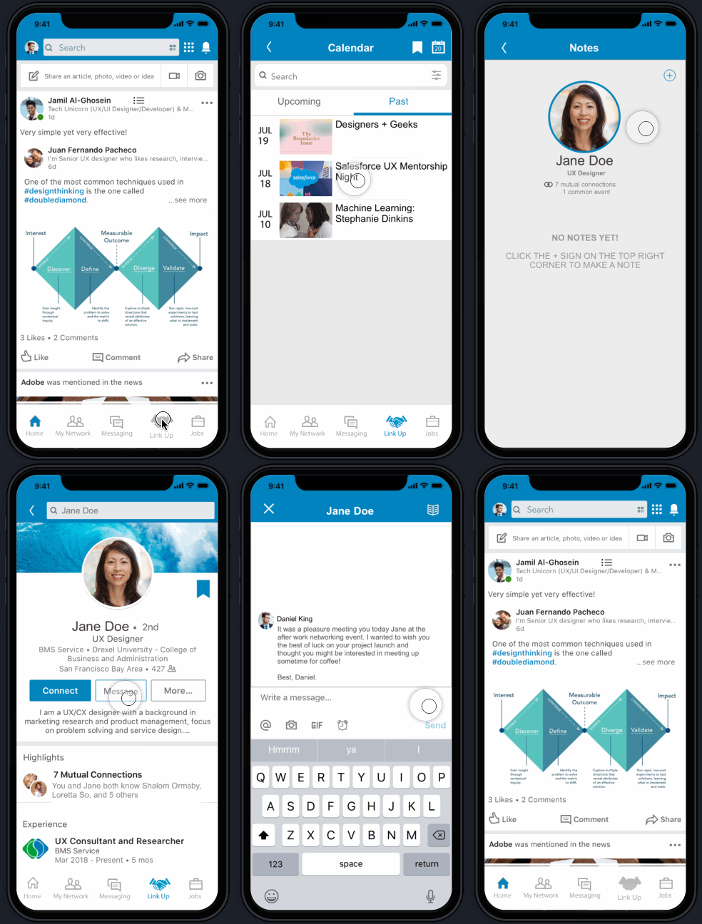
USER FLOW 1: Finding a member from a past networking event and messaging them through a guided prompt
Daniel’s Journey Map
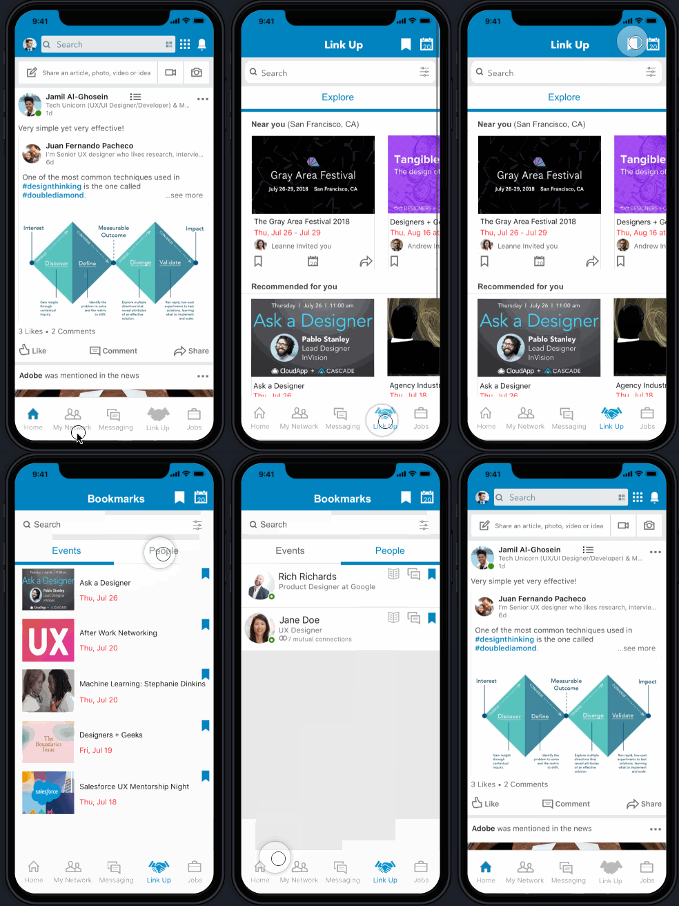
USER FLOW 2: Finding bookmarked people in Bookmarks
Hand sketching ideas and screens provided for multiple iterations based on initial usability testing. This helped us sketch our user flows, journey map, and storyboard.
ITERATIONS
Once we sketched out the new feature on paper, we collaborated for as a team to delegate tasks to each other, I took sole ownership of creating the Low/Medium Fidelity wireframes and converted them into a clickable prototype (view in Prototypes section below) to start testing ASAP.
ITERATED SCREENS FOR THE MESSAGING USER FLOW (FROM LO-FI TO HI-FI WIREFRAMES)
ITERATED SCREENS FOR THE BOOKMARKING USER FLOW (FROM LO-FI TO HI-FI WIREFRAMES)
BONUS: SCREENS FOR THE NOTES FEATURE
“This is something I’ve always wanted on LinkedIn...and the notes addition is a perfect touch to remembering key moments.”
Each phase of usability testing proved immensely valuable because it defined what our users found delightful, painful and areas for improvement:
Round 2 Testing: HI-FIDELITY PROTOTYPE
Likes:
Design brand
Guided prompts
Ability to find attendees from past events
Notes feature
Wants:
Add an “Upcoming” and “Past” events tab side-by-side separate from the “Explore” events tab
Create a simpler flow navigating from adding notes on a member to messaging them
Round 1 Testing : LO/MID-FIDELITY PROTOTYPE
Likes:
Guided prompt
Bookmarking ability
Pinboard page
Events page
Wants:
Calendar and List view
Reference notes in messages
Personalize names with “My”
There were three total prototypes built, see below the final prototypes for user flows: Messaging a user; Bookmarking/viewing bookmarked events & people; and Full user flow with bookmarking, notes & reminder feature:
MESSAGING USER FLOW
BOOKMARKING USER FLOW
FULL USER FLOW WITH BOOKMARKING, NOTES AND REMINDER FEATURE
REFLECTION
Before the project began, my team and I felt extremely driven due to being avid LinkedIn users, however, a few days in, we immediately recognized that keeping the look, brand and feel of LinkedIn throughout the whole process was definitely challenging due to creative constraints. However, the reaction gained from our users were overwhelmingly positive and many were hopeful to see this feature take off in the future.
Next Steps
For a delightful experience, in the “Notes” tab, rearrange the notes in different styles according to a user’s liking such as: list, word clouds, etc (the default being the “tree branches” style)


