
Bringing a co-caring social health community together
A 16-day UX sprint to design the MVP of a social community app connecting caregivers and care-receivers through shared goals, tasks, and authentic support.
Overview
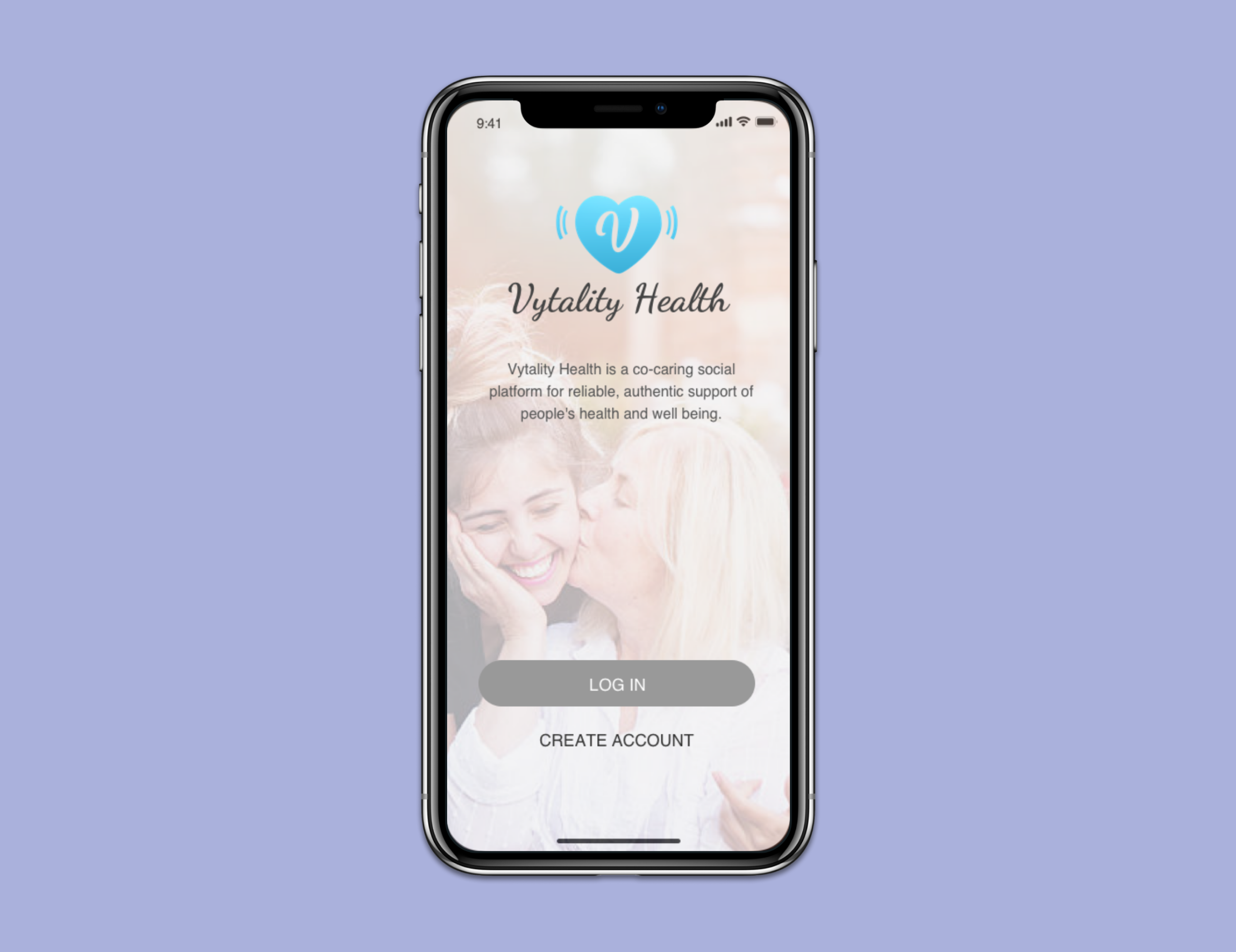
At its core, Vytality Health is a "co-caring" social community app that provides reliable, authentic support while improving well-being and positive healthy social behaviors.
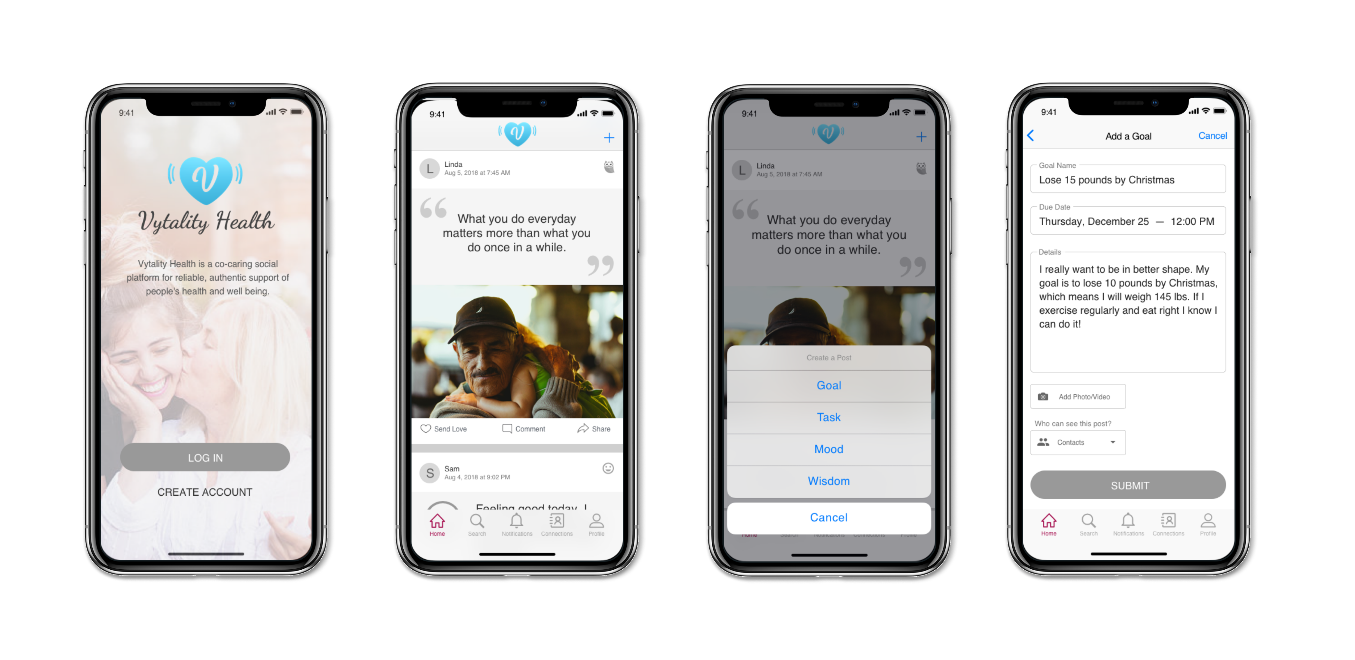
Users post a goal, task, mood, or wisdom note that appears on friends' timelines — encouraging engagement, creating a sense of belonging, and providing emotional and physical support. Every post type brings a unique experience: posting a goal publicly lets the trusted social community provide accountability, while privacy controls give users full control.
Design Challenges
Vytality Health gave us three core challenges:
Final Designs
The final visual composition covered four core flows: Onboarding, Home/Feed, Create a Post, and Connections/Messaging.
Style Guide
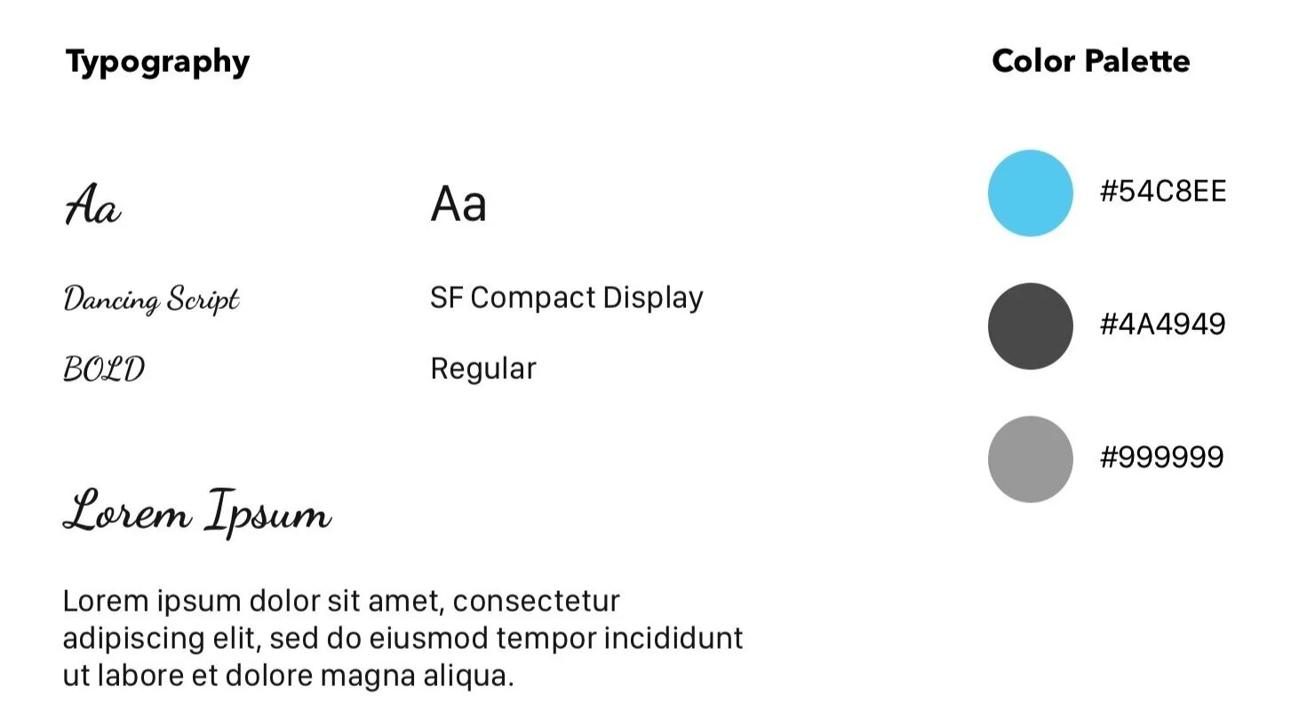
The visual identity used Dancing Script for display headings and SF Compact Display for body copy, paired with a sky blue primary color that conveyed health, trust, and warmth.
Research
Who are the competitors?
To understand the existing landscape of caring apps, we analyzed four direct competitors — Lotsa Helping Hands, Carely, Kinto, and Caregivers in the Community — alongside social apps like Instagram, Facebook, OkCupid, and Rover.
Gaps in caring apps
- Most apps focus on medications and daily health tracking, not community support
- Most common features: profile, contact management, closed group management, commenting, task management
- Community engagement in this space is largely missing
- Gamification is rarely used — a big opportunity to drive engagement
Opportunities from social apps
- Newsfeed with images, statuses, and quotes keeps users returning
- Explore function that surfaces posts and profiles of interest
- An engaging home feed is critical to user retention
- Users value sharing but want privacy controls too
| Feature | Lotsa Helping Hands | Carely | Kinto | Caregivers in Community |
|---|---|---|---|---|
| User profiles | ✓ | ✓ | ✓ | ✓ |
| Contact management | ✓ | ✓ | ✓ | ✓ |
| Closed group management | ✓ | ✓ | ✓ | ✓ |
| Task management | ✓ | ✓ | ✓ | – |
| Commenting | ✓ | ✓ | – | ✓ |
| Health / medication tracking | ✓ | ✓ | ✓ | – |
| Social community feed | – | – | – | – |
| Explore / discovery | – | – | – | – |
| Gamification | – | – | – | – |
| Privacy controls | – | ✓ | – | – |
User Interviews & Findings
Our client provided an initial contact list, but the target user type was too broad. After conducting 13 in-depth user interviews and 7 surveys (collecting both quantitative and qualitative data), we identified two distinct target user categories: Caregivers and Care-receivers.
"I'd love emotional support from others whether they're friends or strangers — when I'm feeling sick, emotional support is 100% helpful."
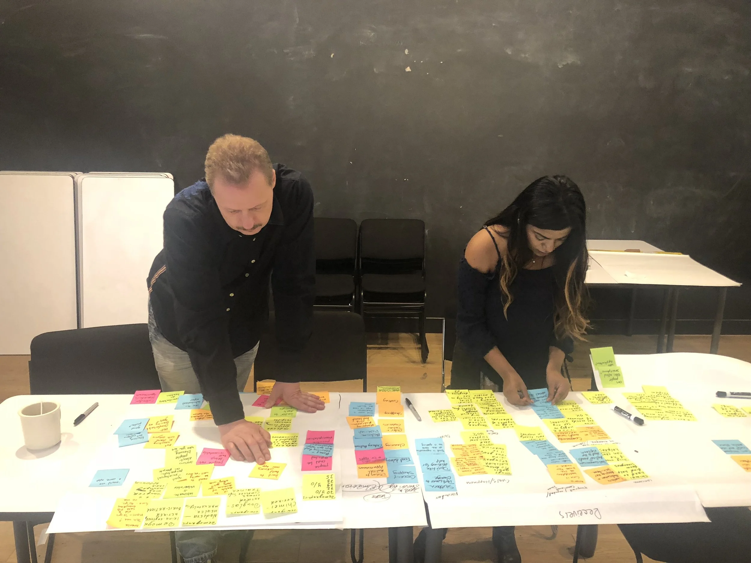
— User interview participantAfter affinity mapping, we uncovered clear patterns around pain points, challenges, and delights. The survey data confirmed the demand for a community-driven care platform:
They don't like asking for help
CaregiverI'm worried about their safety
CaregiverWe make appointments ahead of time
CaregiverI have no energy somedays
CaregiverI'd love to find a Facebook group where I can offer my help to others
CaregiverI don't feel comfortable asking for help from my friends
Care-receiverUsually I can take care of myself
Care-receiverMy community keeps me better
Care-receiverMy goal is to become healthier and lower my blood pressure
Care-receiverI'm grateful for my family for taking care of me
Care-receiverDefine
Personas
I created three personas from our research — each a direct reflection of the real users we interviewed. The unique stories grounded our design decisions throughout the project.
Retired software trainer, volunteers at his hospital, passionate about helping others
Retired businessman with Parkinson's — wants family support and to stay connected
Manages GAD while supporting others — needs a community that understands both roles
Problem & Solution
Problem
People who need care are not aware of apps that can help them with their needs while providing a community to engage with others. Likewise, people who want to help are also not aware of apps that provide a community and list of people who need care.
Solution
Design a simple yet engaging app for caregivers and care-receivers that uses a matching system to connect them with each other based on their respective needs, location, and social profile.
Design
Sketches
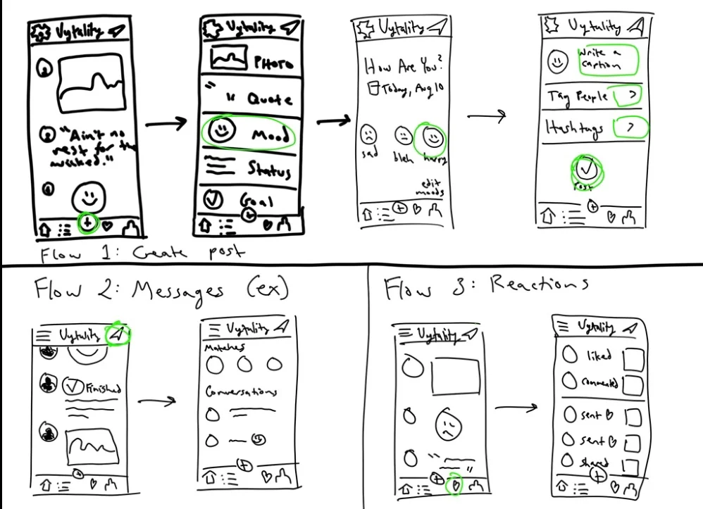
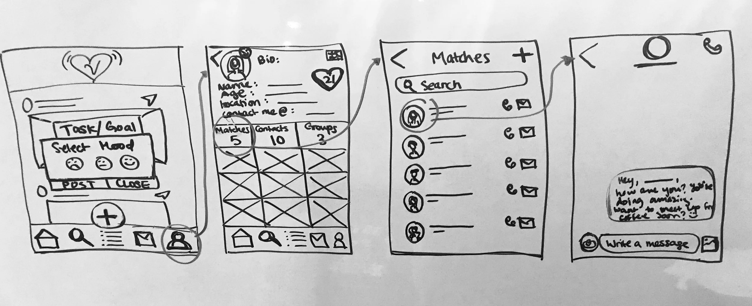
Before opening Sketch, we brainstormed ideas across three user flows: creating a post, messaging a match, and sending a reaction. After consulting with our client, we focused on the first two flows and scrapped reactions — reducing scope to keep the MVP lean and testable.
Wireframes
Our scope called for low or medium fidelity wireframes — but we went above and beyond, delivering a high-fidelity wireframe and a full visual composition. Each flow went through multiple rounds of lo-fi to mid-fi iteration before reaching hi-fi.
Onboarding

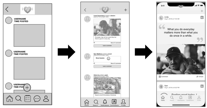
Home / Feed
Create a Post
Connections / Messaging

Key Iterations
Iterations were the "meaty" part of the process — every design change was backed by usability testing evidence. Key changes included:

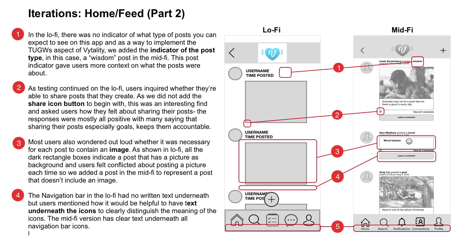
Home / Feed — removed Plus icon from lo-fi; moved post creation to top right
Users were confused by the Plus icon placement. Testing confirmed top-right matched their mental model of "create" actions.
- Added post type indicator (Goal, Task, Mood, Wisdom) based on user feedback
- Navigation bar labels added after users couldn't identify icon meanings
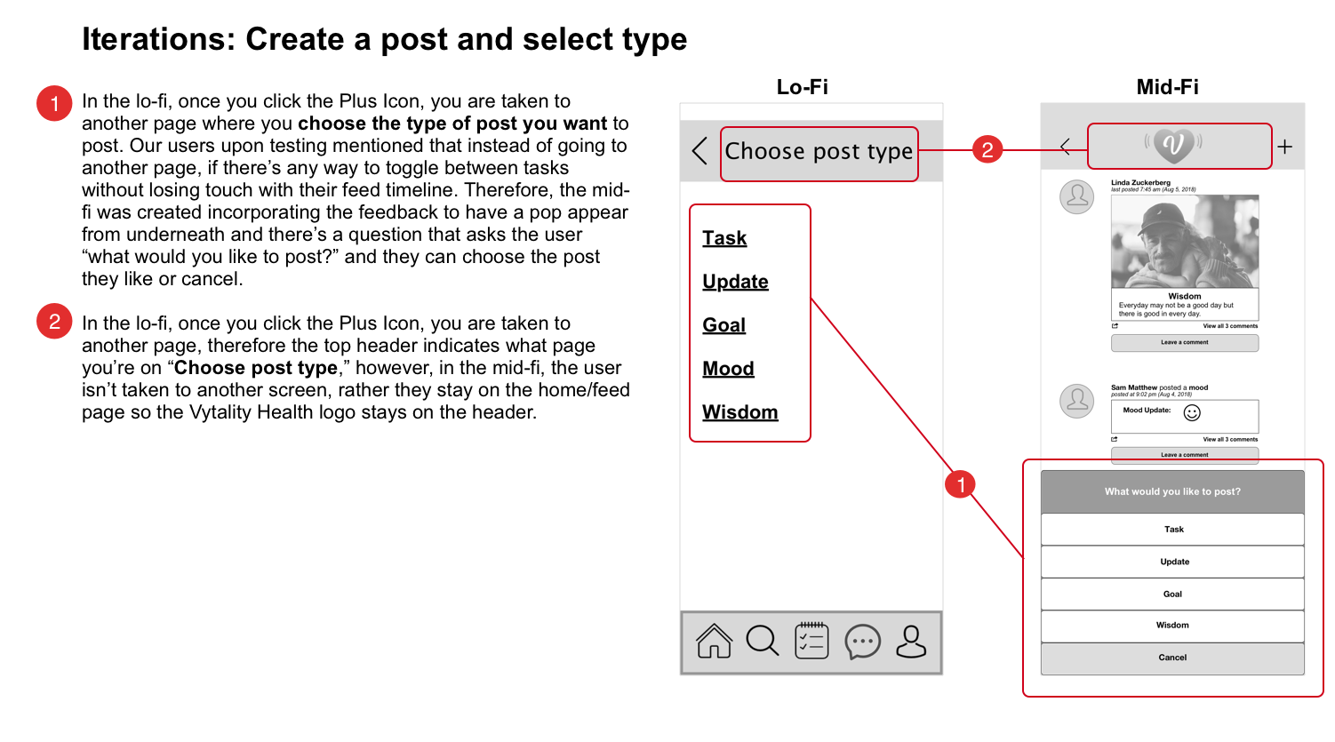
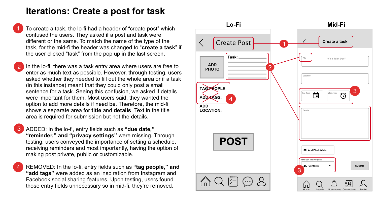
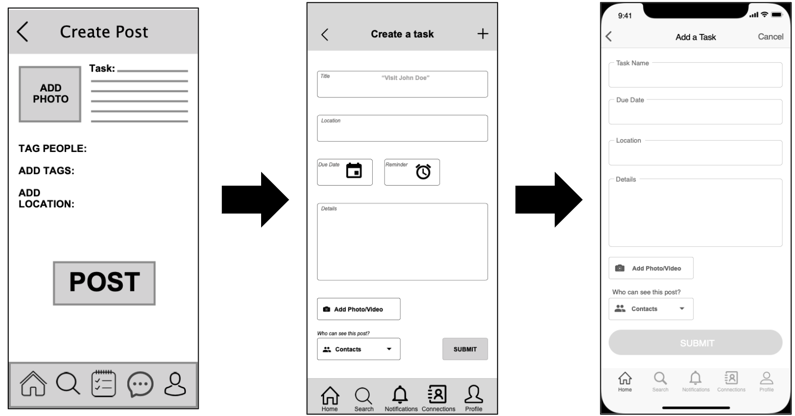
Create Post — streamlined task creation flow with clearer due-date field
Users couldn't find where to add dates in lo-fi. Added a visible date field and reminder option — users indicated reminders were essential for task accountability.
- Removed "tag people" field to reduce cognitive load on first-time posting
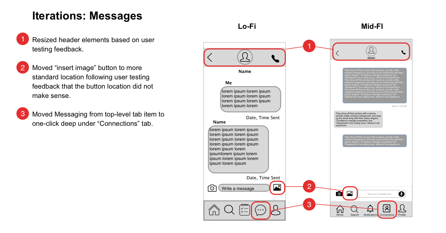
Connections — renamed "Matches" to "Connections"; added category filtering
"Matches" felt too much like a dating app to users. "Connections" better reflected the co-caring relationship dynamic.
- Added tabbed filtering: Care Recipients / Trusted Circle / Leagues of Love
- Moved Messaging from top-level to nested under Connections
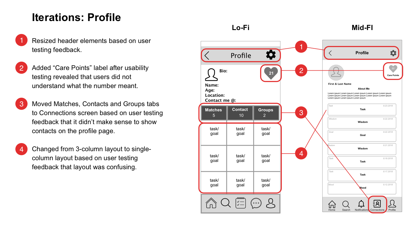
Profile — reduced header size; moved from 2-column to 1-column layout
Users found 2-column layout confusing on mobile. "Care Points" label wasn't understood — clarified in mid-fi with supporting context.
- Reduced font sizes across the app after testing revealed they were too large
- Updated nav icons to use standard "leaf" icon — original icon meaning was unclear
Testing
Usability Testing & Findings
Any progression through wireframes must be explained through usability testing — it's all about user satisfaction. We had 13 users test our prototypes across multiple rounds, asking them to think aloud as they completed each flow.
Beyond verbal feedback, we paid close attention to body language — noticing signs of delight, confusion, and surprise that users didn't always articulate. Testing proved successful across all rounds, and every iteration was backed by rock-solid, detailed evidence when presenting to our client.
Interactive Prototype
Our final deliverable to the client was a high-fidelity InVision prototype — not just the visual composition. This gave the Vytality Health team a realistic, clickable experience to validate with stakeholders before development began.
Reflection & Next Steps
Next Steps
Throughout the sprint, we surfaced many "aha" moments — insights that went beyond the MVP but set a clear product roadmap for Vytality Health:
In 16 days, our team ran through the full UX design cycle — from research to hi-fi prototype — and accomplished more than we imagined. Our client was absolutely delighted and excited to ship the design for the December 2018 MVP launch.