MyShake — Early Earthquake Warning App
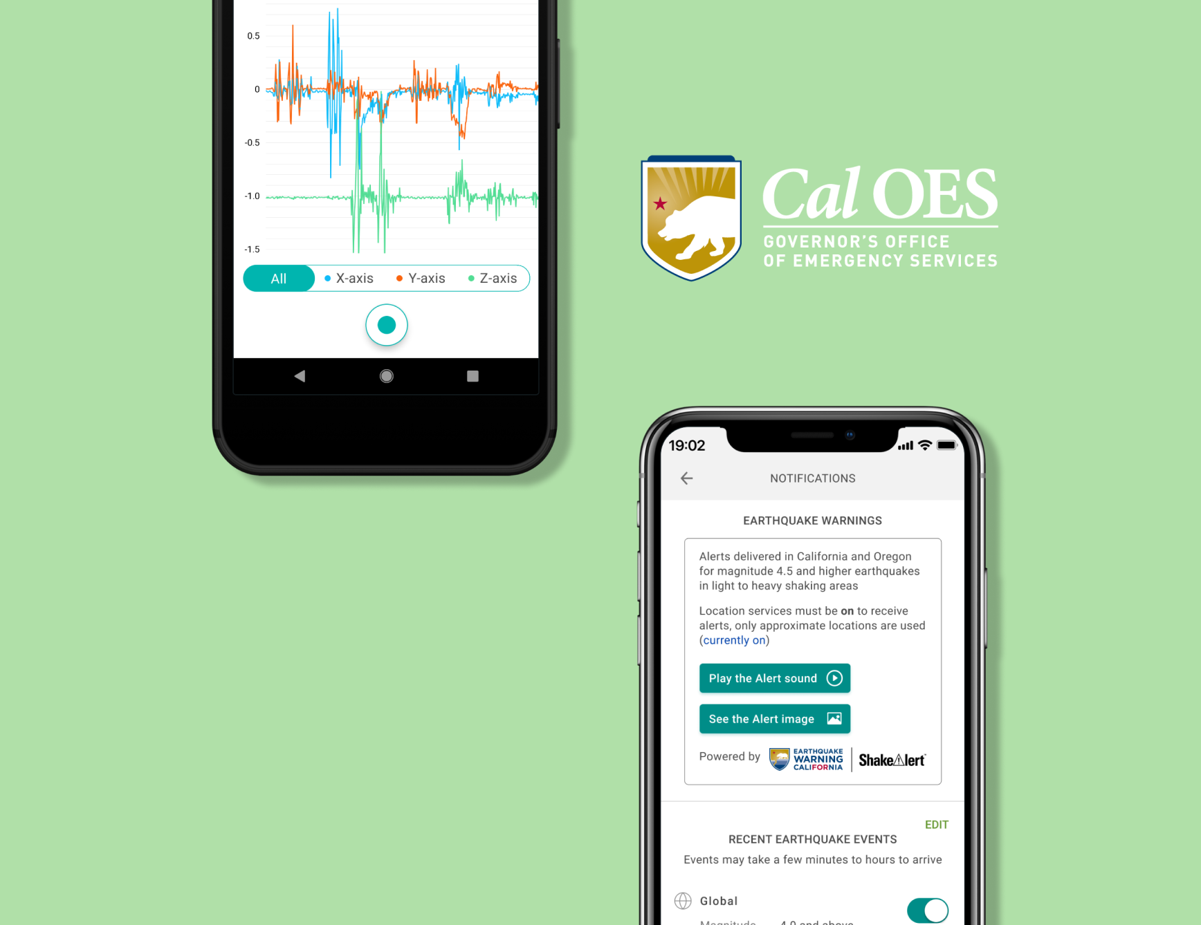
MyShake is a citizen science app originating from UC Berkeley that uses machine learning to turn smartphones into earthquake sensors. The app's ML algorithms analyze phone accelerometer data to detect earthquake shaking, feeding research models for structural health monitoring and ground-motion prediction. Early warning alerts are powered by USGS ShakeAlert's automated seismic algorithms. The app also allows users to report earthquake experiences and educates about earthquake safety.
Overview
I led a comprehensive accessibility audit and redesign of the MyShake app to ensure WCAG compliance and equitable access to earthquake early warnings. I owned UX research and design, QA, customer service integration, and copywriting while navigating key challenges: team resistance to changing brand design, building expertise with VoiceOver and TalkBack, and pandemic-related testing constraints that limited access to differently-abled users.
Impact
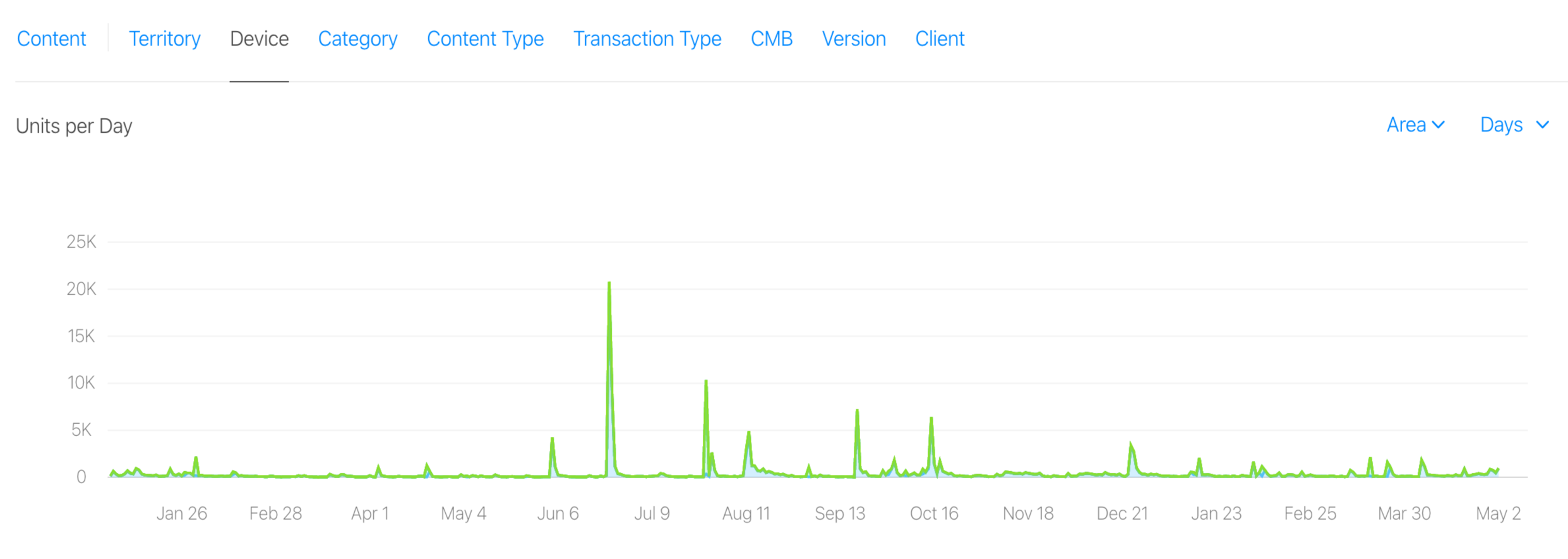
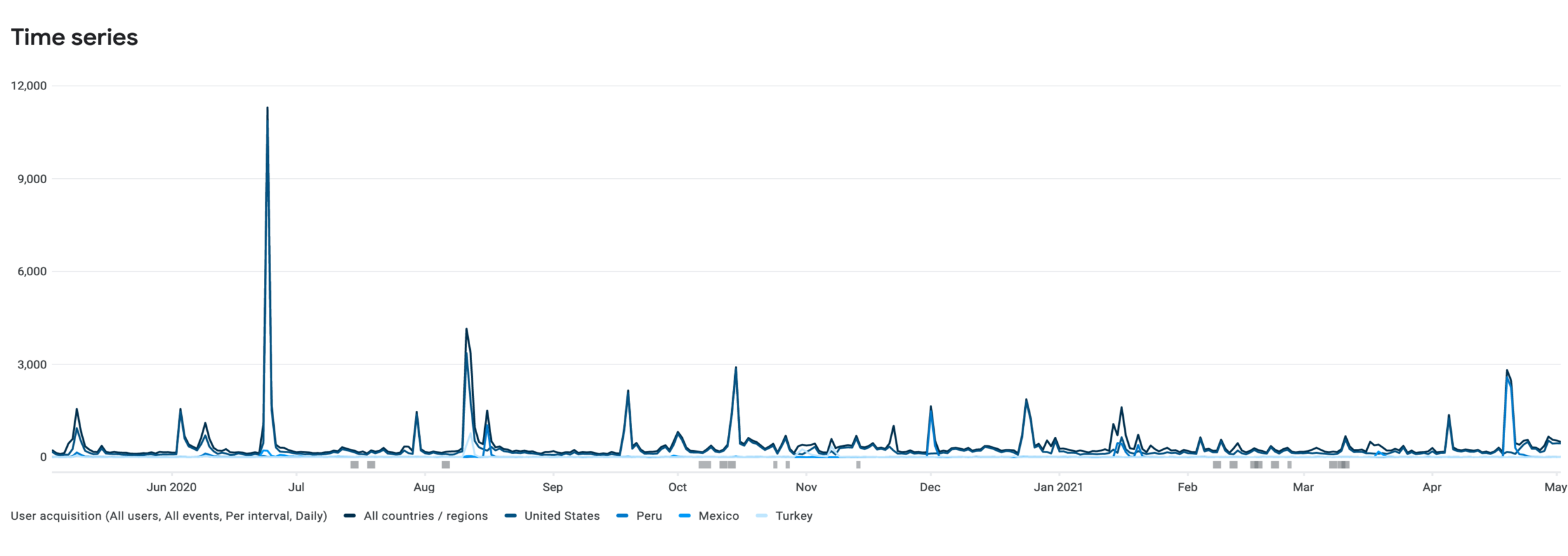
Key outcomes from the accessibility-centered redesign approach:
Background & Challenge
What is MyShake?
MyShake is an ML-powered citizen science app from UC Berkeley. It uses machine learning to detect earthquakes through smartphone accelerometer data, distinguishing real seismic activity from everyday phone motion. Crowdsourced sensor data feeds research models for structural health monitoring and ground-motion prediction, while early warning alerts are powered by USGS ShakeAlert's automated seismic network.
The Problem
Not all users were able to use the app to its full capabilities. By not adhering to WCAG (Web Content Accessibility Guidelines), the app faced legal risks, frustrated differently-abled users, created life-threatening situations for those who couldn't access critical alerts, and limited the user base.
Evidence from App Store Reviews
"Great idea! To foster safety in warning me prior areas currently are NOT accessible to differently-abled buttons. VoiceOver enables input! Low vision users make great beta testers. Would love to see developers consider making this inherently life saving tool available to everyone!"
App Store Review"As a voiceover user on iOS I was disappointed to find there were several areas of unindexed content within this app. Please work on fixing accessibility for voiceover so that app navigation for blind and visually impaired iOS users with future updates."
App Store Review"It's gross (sic) that doesn't care about the people that have disabilities! They've been sued before but they clearly haven't learned!"
App Store Review"Blind users using VoiceOver will encounter issues using this app. I hope a future version will reflect more attention to accessibility."
App Store ReviewKey Challenges
- Initial pushback due to competing priorities and lack of team understanding about accessibility importance
- Fear of moving away from established brand design
- Minimal background knowledge of VoiceOver and TalkBack for accessibility testing
- Lack of access to differently-abled users for usability testing
- Resource constraints and testing scheduling troubles due to 2020 Coronavirus Pandemic
Who's Affected?
Behind the legal risk and the statistics were real people whose safety depended on this app working for them. To ground the redesign in human reality, I built out two personas representing the two personas anchoring the redesign in the experiences most at stake — one sighted user whose experience was being degraded by poor UX, and one blind user for whom inaccessibility meant the app simply didn't exist.
Research
Understanding the Landscape
- MyShake had over 1.3 billion potential users worldwide living with vision impairment, and 56+ million in the US alone.
- 71.8% of mobile users rely on screen readers — yet the app had no screen reader compatibility.
- 814 accessibility-related lawsuits were filed in 2017, signaling real legal risk beyond just user frustration.
I collaborated with UC Berkeley's Head of Web Accessibility and CalOES's Emergency Manager to understand both the technical and civic stakes.
Who We Were Designing For
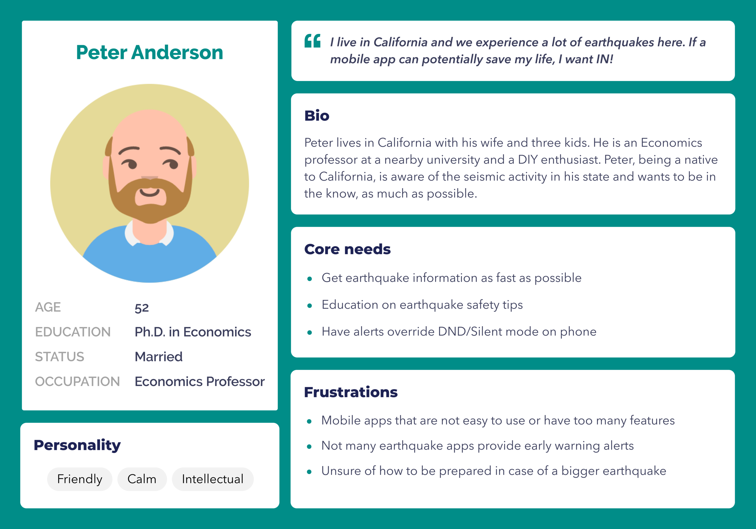
I developed two personas to represent the range of users being underserved:
Persona 1
Peter is a sighted California resident who needs fast, no-friction access to earthquake alerts. His frustrations — overly complex apps, no DND override, unclear safety guidance — shaped the notification redesign and descriptive UX copy work.
Persona 2
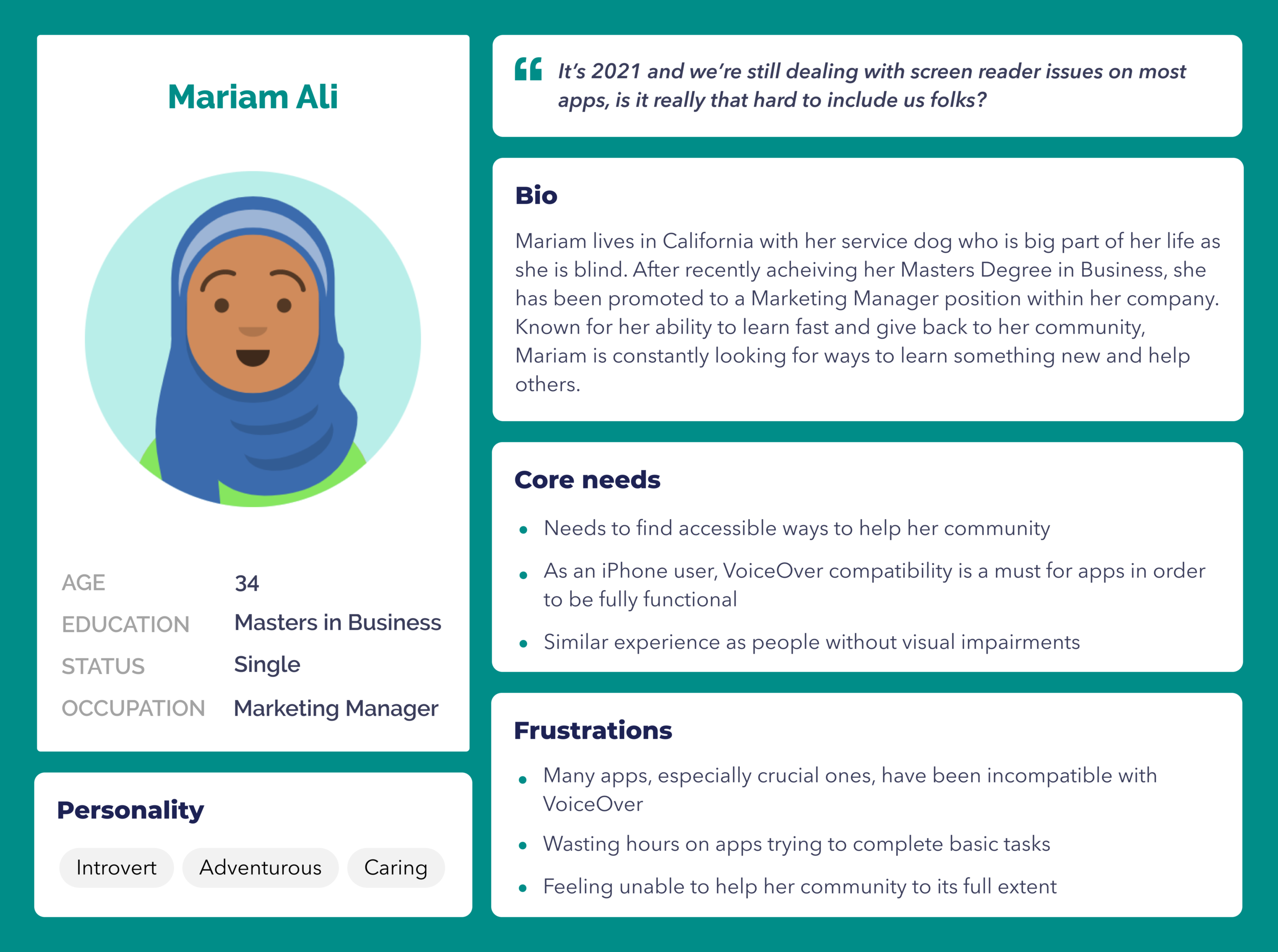
Mariam is blind and relies entirely on VoiceOver to use her iPhone. Her experience of wasting hours on inaccessible apps, and feeling unable to help her community, became the human center of this project. Her needs directly drove the alt-text, button labeling, heading hierarchy, and screen reader compatibility work in Phase 1.
What the Research Made Clear
The App Store reviews weren't outliers — they mapped almost exactly onto both personas' frustrations. Accessibility wasn't a nice-to-have. For Mariam, it was the difference between receiving a life-saving alert or not. For Peter, it meant the difference between an app he'd actually keep installed versus one he'd abandon.
My Role & Approach
I spearheaded and owned this project from start to finish, beginning with an initial accessibility audit through development implementation.
My Responsibilities
- UX Research & Design
- Quality Assurance
- Customer Service integration
- Copywriting
- Accessibility advocacy and education


Process & Scope
The project required multiple phases as other priorities needed attention. I broke down the work into two main phases:
Phase 1 (Nov 2019 – Jun 2020)
- Label all buttons, text, and UI elements
- Ensure content reads in proper visual hierarchy order
- Add alt-text for all images/non-text content
- Change primary and secondary colors for better contrast
- Increase font sizes
- Break down lengthy paragraphs in Experience Report for digestibility
Phase 2 (Dec 2020 – Apr 2021)
- Refine magnitude scale colors
- Add descriptive copy to buttons for better UX
- Add accessibility-focused images to Safety page with alt-text
- Answer accessibility questions in Help/FAQ
Solution
Design Outcomes
- Redesigned for visually impaired and colorblind users.
- High contrast ratios for brand elements, magnitude indicators, buttons, and UI.
- Proper labeling for buttons, hierarchy, and headings.
- Compatible with VoiceOver, TalkBack, and screen readers.
- Focused on blind/visually impaired accessibility.
- Added haptic feedback for deaf/hard of hearing users.
- Enhanced CTA buttons and links.
- Improved clarity for all users, especially blind/visually impaired.
Key Page Redesigns
Home/Recent Page
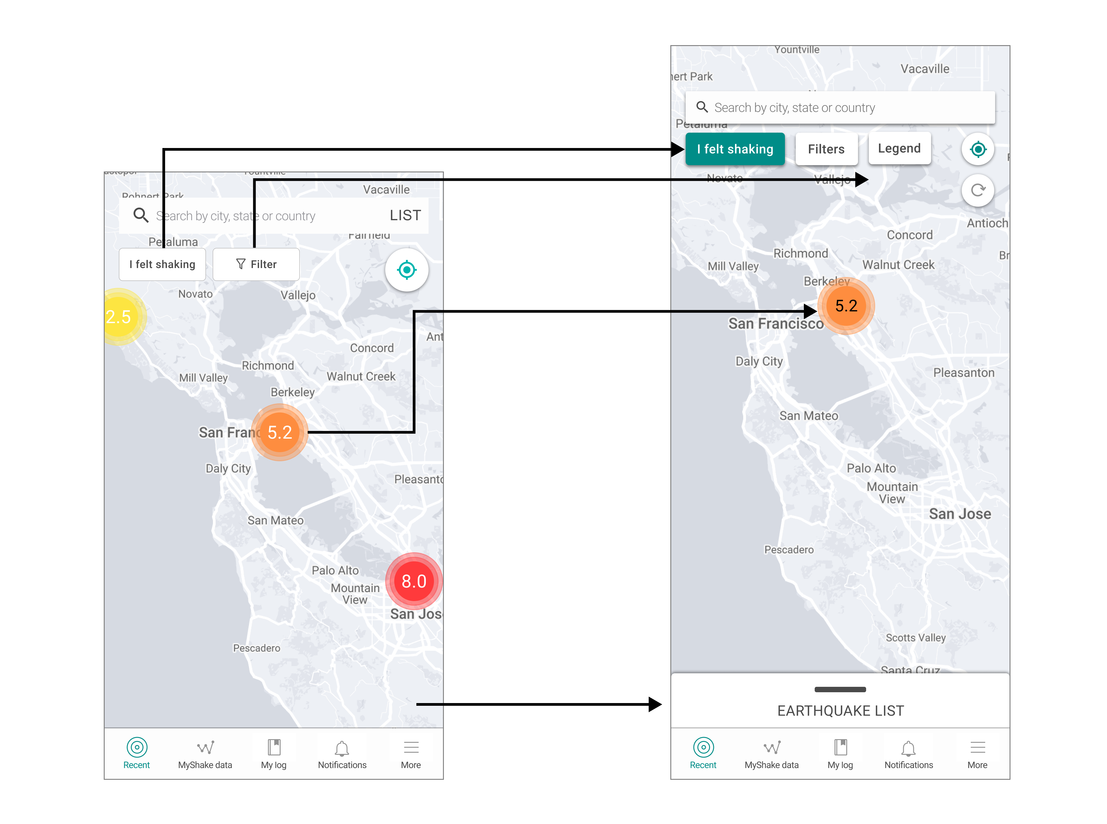
What changed
- Navigation bar colors updated
- List placement updated
- List swipe up feature added
- Legend button added
- Refresh button added
- Drop shadow on search bar and CTA buttons
- Accessible magnitude colors on map
Why it matters
Every interactive element is now visible and reachable for users with low vision, and the map communicates earthquake severity without relying on color alone.
Legend & Filter Page
 Filter
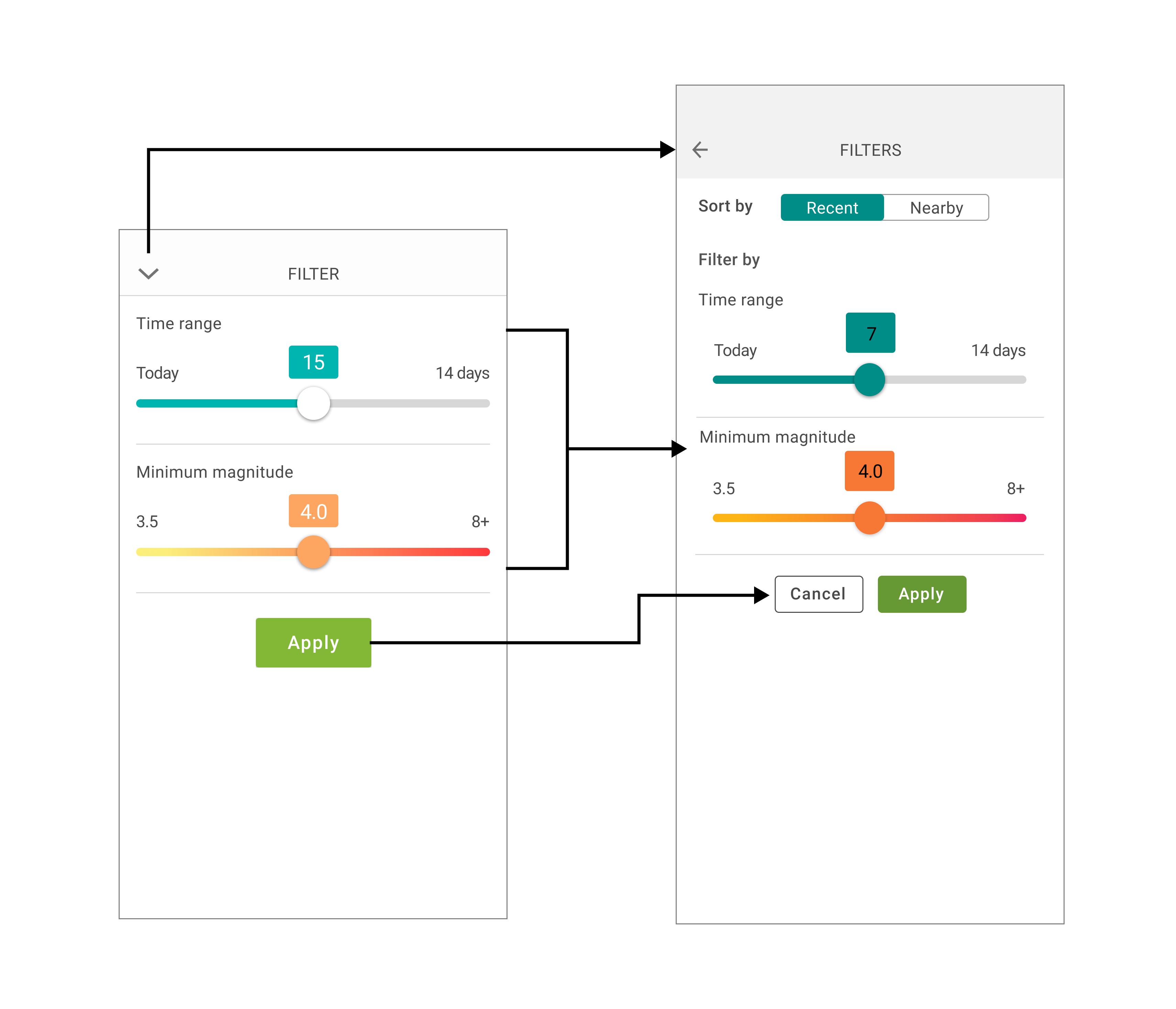
What changed
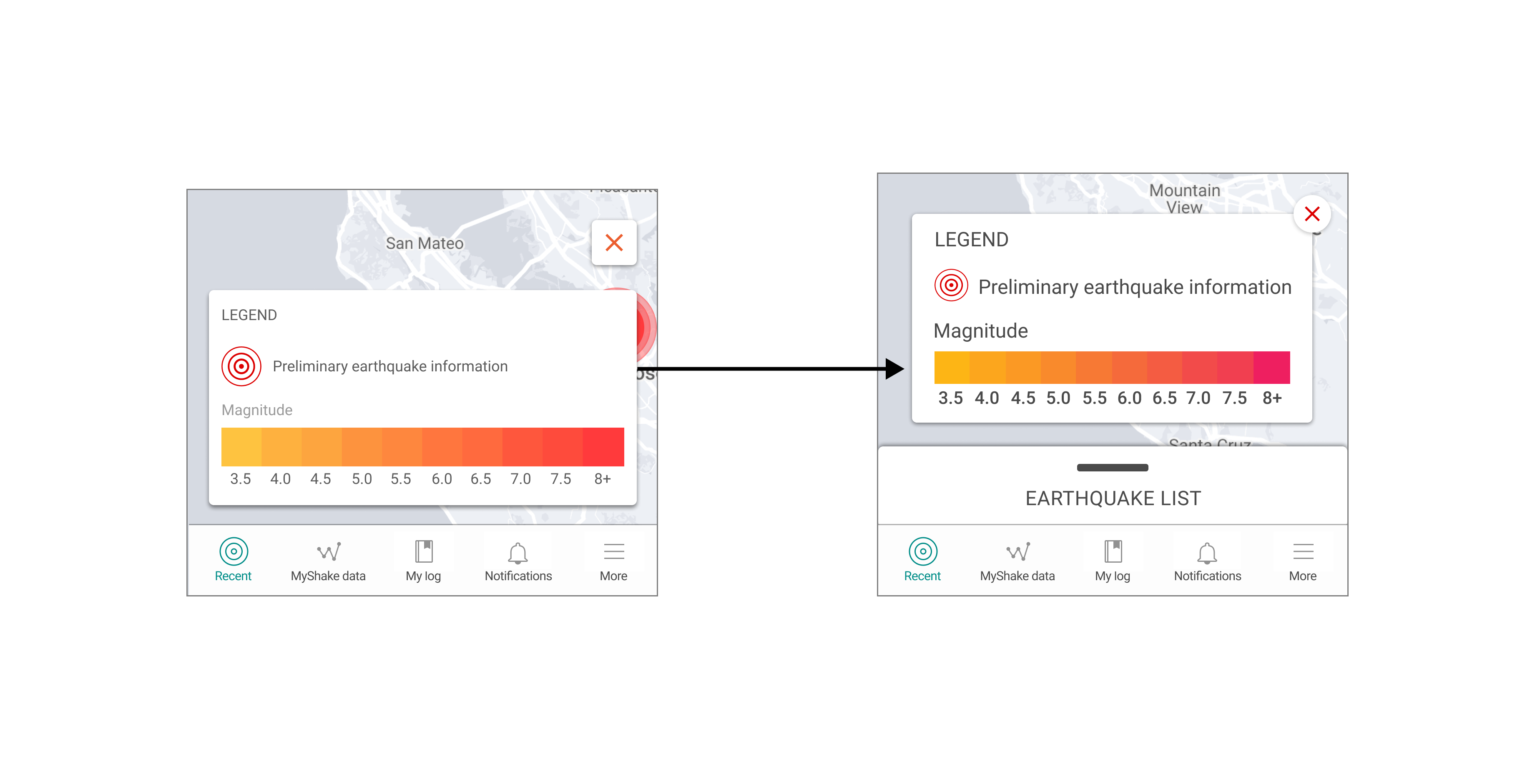
- Magnitude color scale updated to be more accessible
- Cancel button added to Legend
- Dropdown chevron replaced with a proper back button
- Filter colors updated for better contrast (e.g. black text on background)
- Sort by toggle added with Recent and Nearby options
- Cancel button added to exit the filter page
Why it matters
Users can now navigate in and out of filters and the legend without getting stuck, and every control meets contrast standards for low vision users.
List View
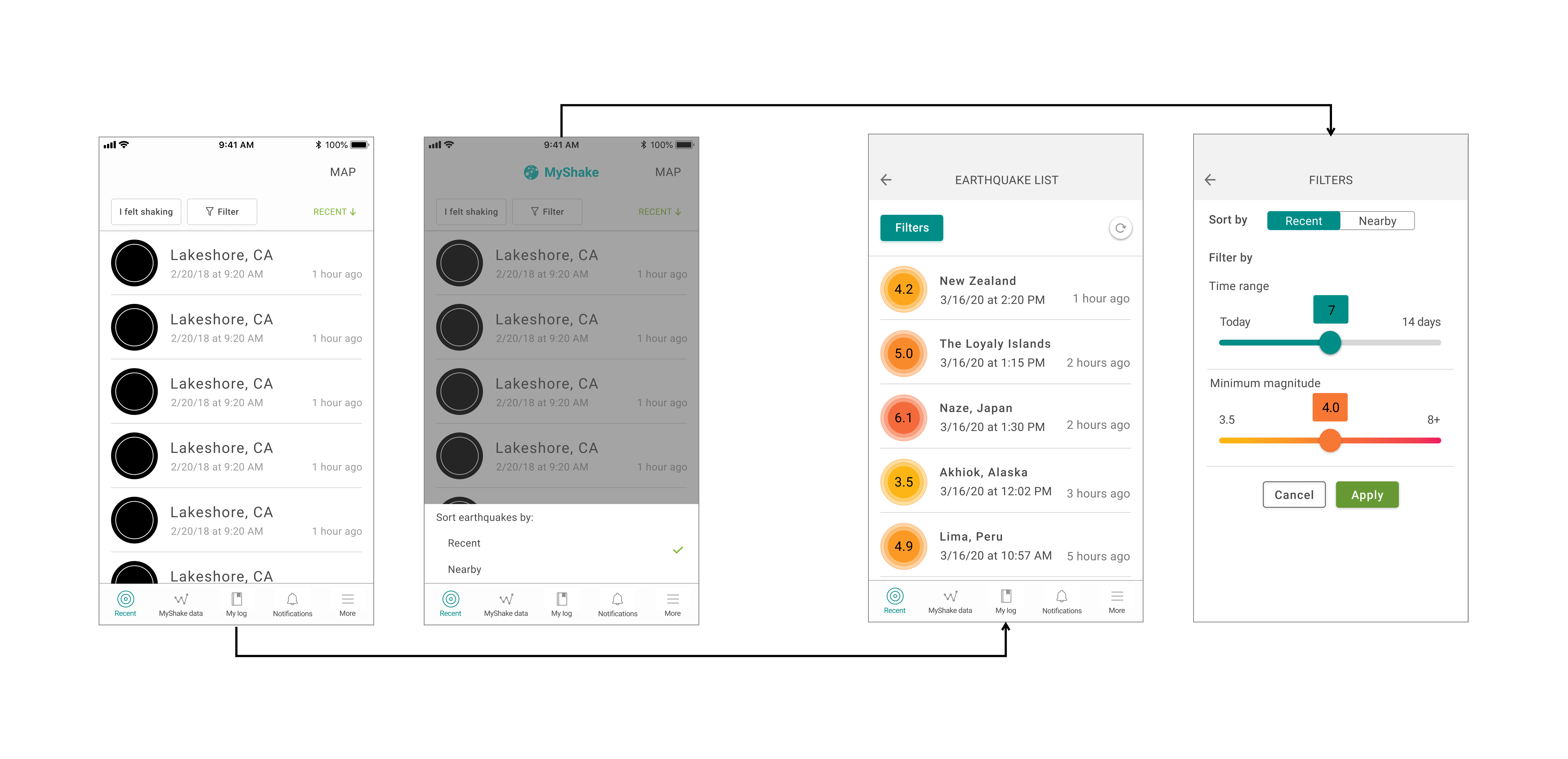
What changed
- Back button added to List view
- Dedicated Filters button added for sorting and filtering
- Map text button removed
Why it matters
Navigation is now straightforward and screen reader friendly, with no dead-end states.
Experience Report
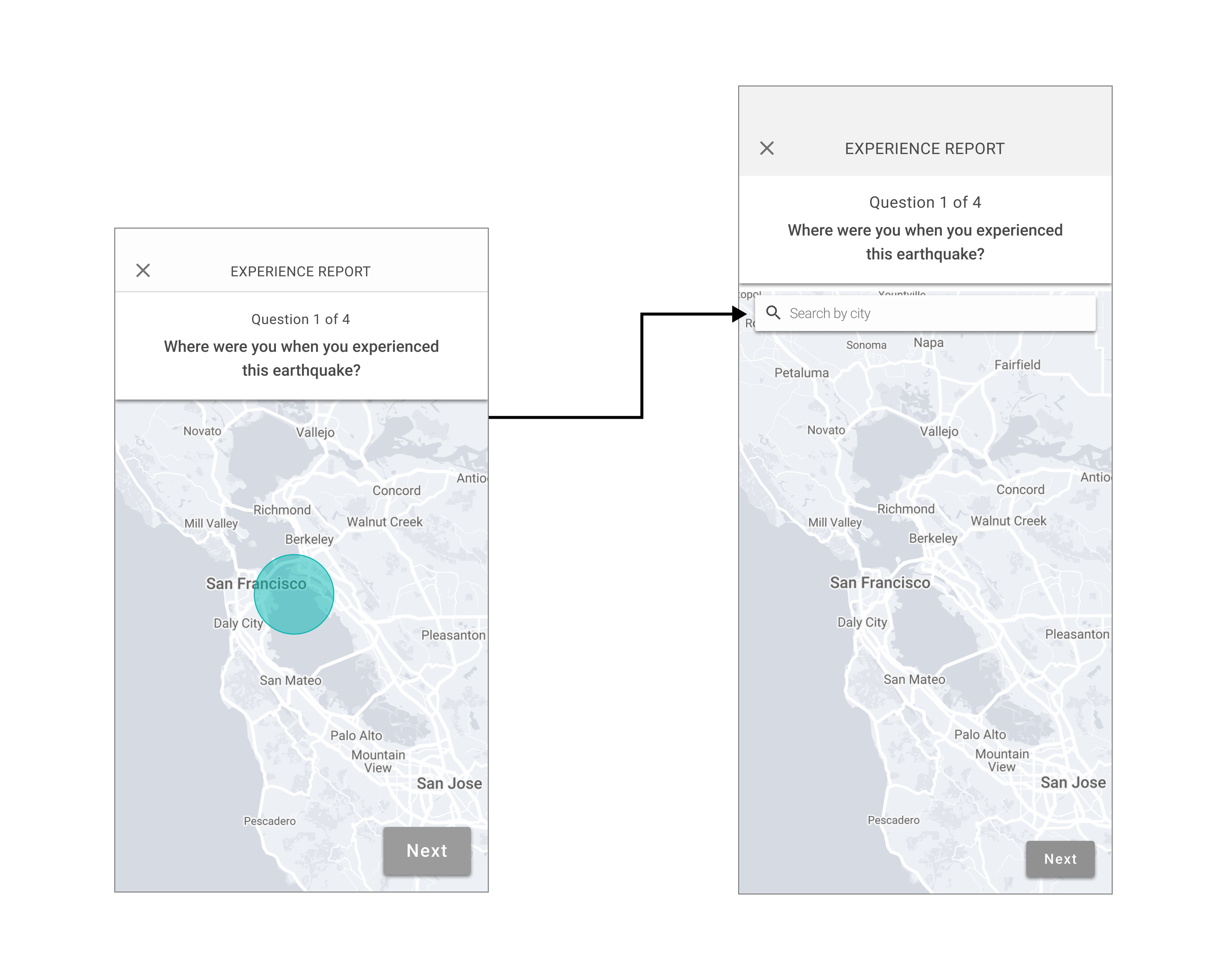
What changed
- New search bar with a labeled form field added
- Speech dictation enabled within the keyboard
Why it matters
Users who can't type manually can now complete the experience report using their voice.
Notifications
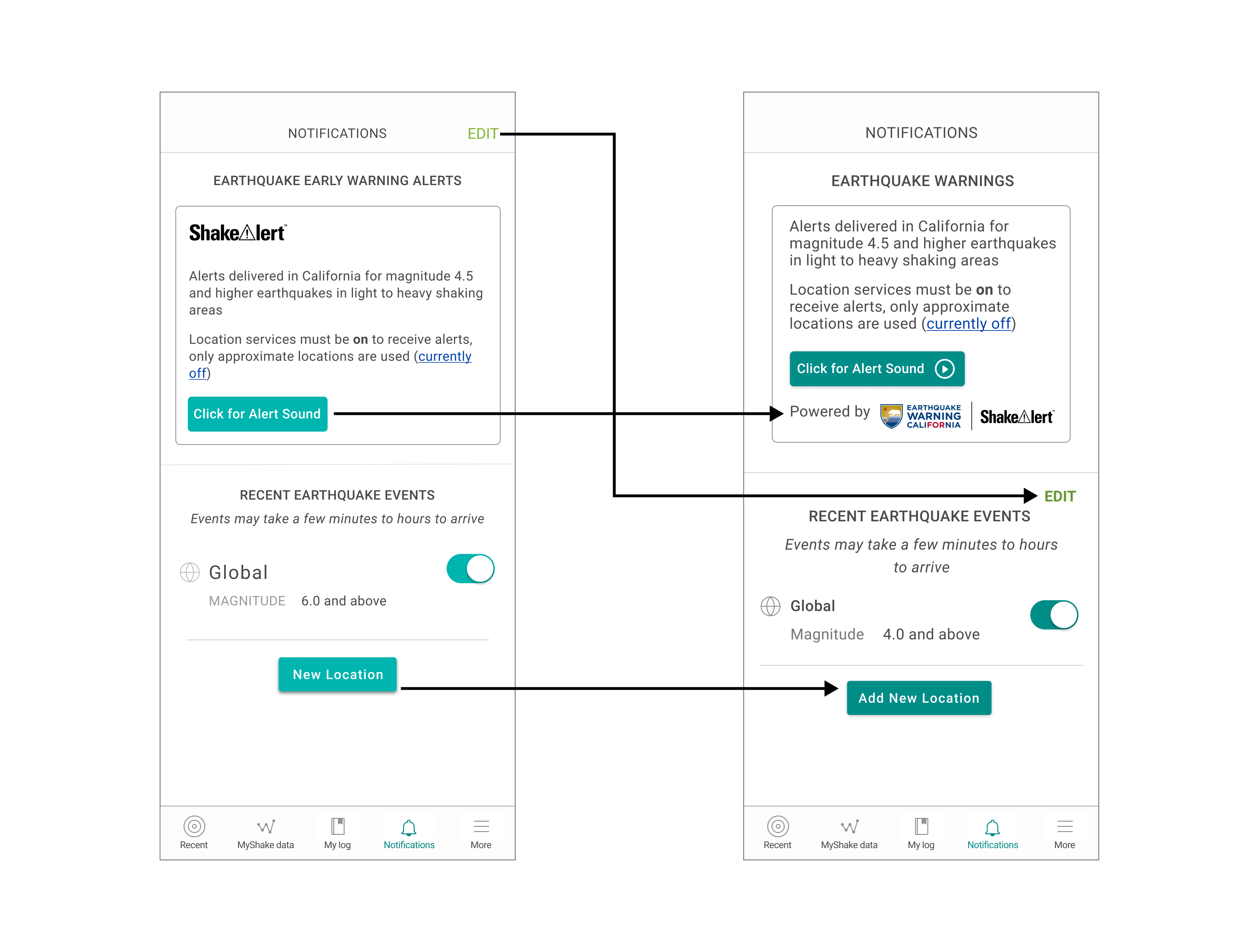
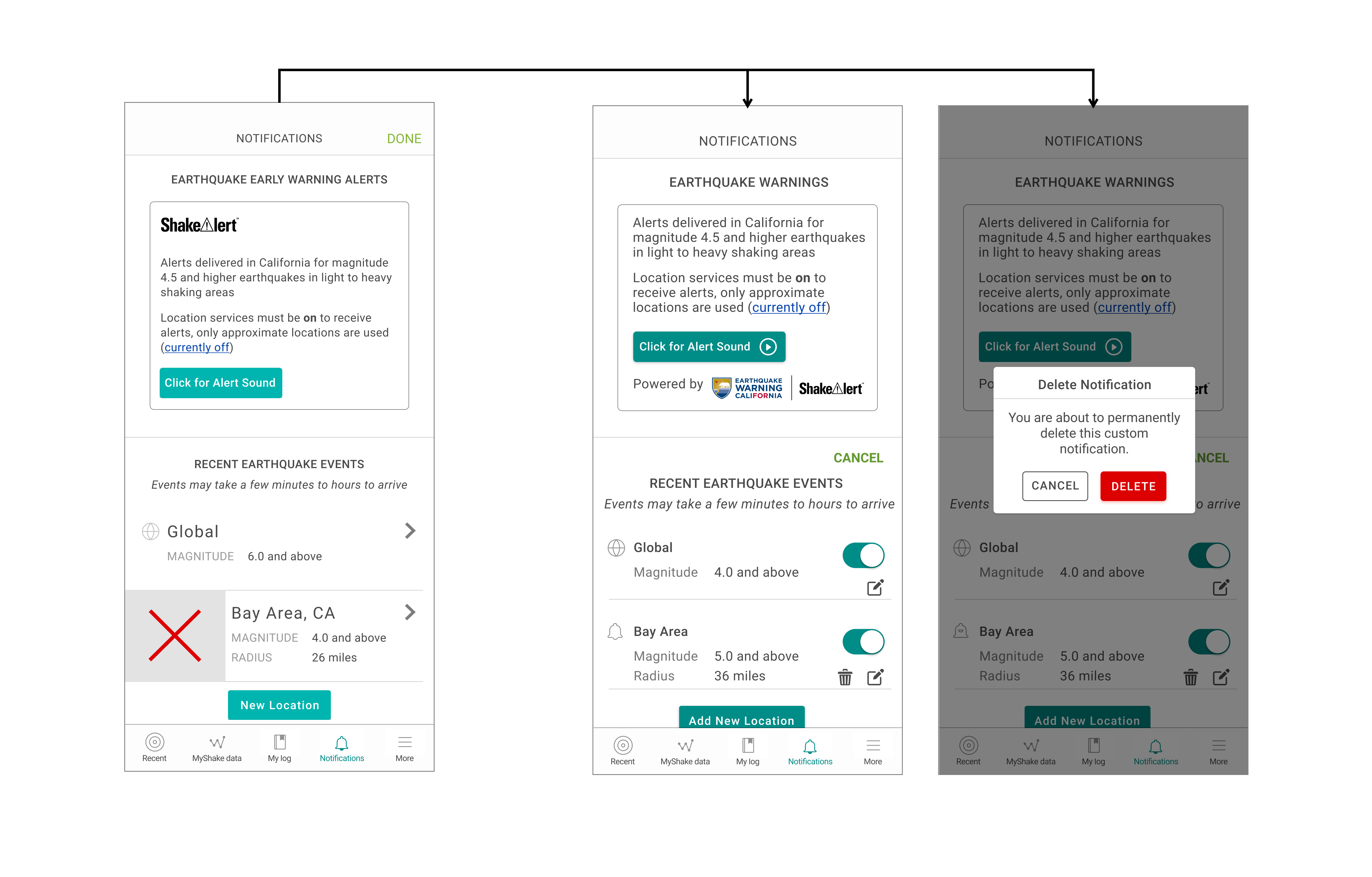
What changed
- EDIT button placement updated
- UI element colors updated
- Descriptive copy added to New Location button
- New Location button repositioned on Android
- Vibration integrated with Alert sound
- Accessible deletion and editing flow added
Why it matters
Deaf and hard of hearing users now receive haptic alerts, and all users can manage notifications without ambiguity or confusion.
Safety Page
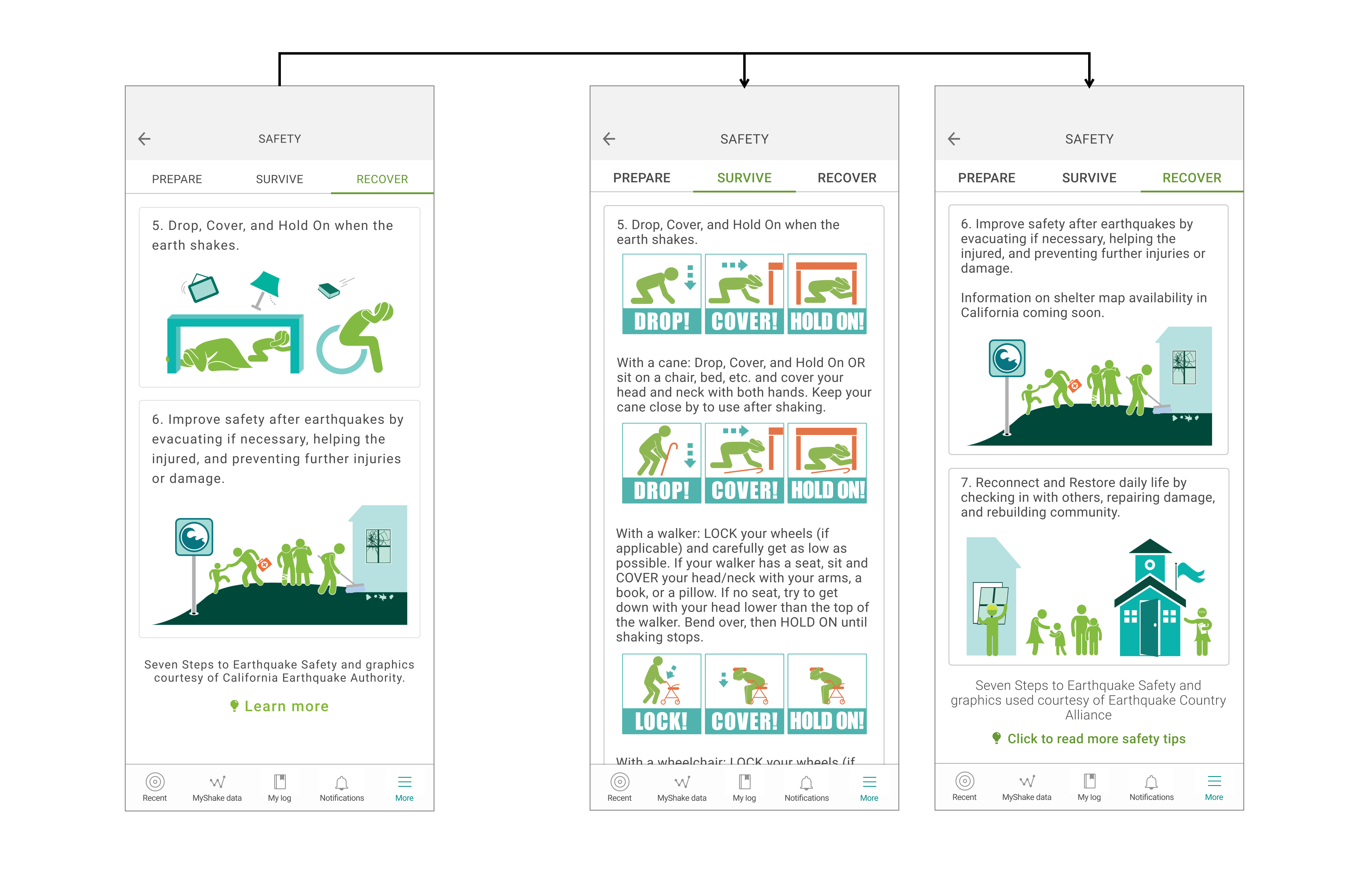
What changed
- Descriptive link copy added
- Accessibility-focused imagery with alt-text added
Why it matters
Screen reader users can now fully navigate the Safety page and access earthquake preparedness information independently.
Tradeoffs
Vibration over Full Audio Customization
Delivered immediate, high-impact accessibility for deaf and hard-of-hearing users — haptic feedback could ship within the current release without requiring new audio infrastructure.
- Full audio customization deferred to a future phase
- Users relying on audio-only feedback not fully served
- Solution shaped by engineering constraint, not user need alone
Brand Palette vs. Accessibility Compliance
Every user, regardless of vision ability, can read the interface — WCAG contrast requirements met across the board.
- Accessible colors are less vibrant than the original palette — the design doesn't look as visually striking as it once did
- Significant stakeholder pushback because the new colors "didn't look good"
- Had to build an internal case for why compliance mattered more than aesthetics
Specialist Testing over Broad User Testing
Partnered with a UC Berkeley accessibility specialist for expert-led testing — rigorous, principled feedback even when broader user access wasn't possible.
- Testing with one specialist, not many — a single perspective, however expert, can't capture the full range of lived experience
- Access to a wider pool of differently-abled testers was cut off by COVID timing
- A gap I'd prioritize closing in a future phase with broader participatory testing
VoiceOver before TalkBack
iOS VoiceOver shipped first, immediately serving the larger portion of the user base with full screen reader support.
- Android TalkBack users had no screen reader support until the next phase
- Sequencing driven by bandwidth, not user need
- Temporary accessibility gap between platforms
Next Steps
The work isn't done — Phase 3 is ongoing.
- Flashing lights integrated with Alert sound (in progress)
- Hazard scale, PAGER alert, and Sensor axes color updates (in progress)
- Accessibility work extended to Help, My Log, and Sensor pages
- Accessible colors, fonts, and components folded into the new Design System
Reflection
Working on accessibility was the most tedious yet rewarding work I've done at MyShake. It changed how I think about design — not as a visual exercise, but as an act of inclusion.
Key learnings
- Accessibility is a culture, not a project
- Advocating for it as a designer requires building the business case, not just the designs
- Learning VoiceOver and TalkBack firsthand is a superpower
- Working in phases with clear priorities keeps complex work from stalling
- Finding and testing with differently-abled users takes dedicated effort — and is worth it