Link Up — Networking & Contact Management
A concept feature for LinkedIn that surfaces local industry events and gives professionals a smarter way to manage contacts, notes, and follow-ups — all in one place.
Overview
If you've ever attended a networking event, you probably found it through Facebook, Meetup, Eventbrite — or some other platform other than LinkedIn. Meeting professionals 1:1 is also relatively easy these days through Shapr and mutual connections. So where does LinkedIn fit in?
LinkedIn is one of the top platforms for job searches, with the advantage of connecting with other professionals. But imagine a world where LinkedIn also offered networking events and efficient contact management as part of their core services. That's exactly what my team set out to explore.
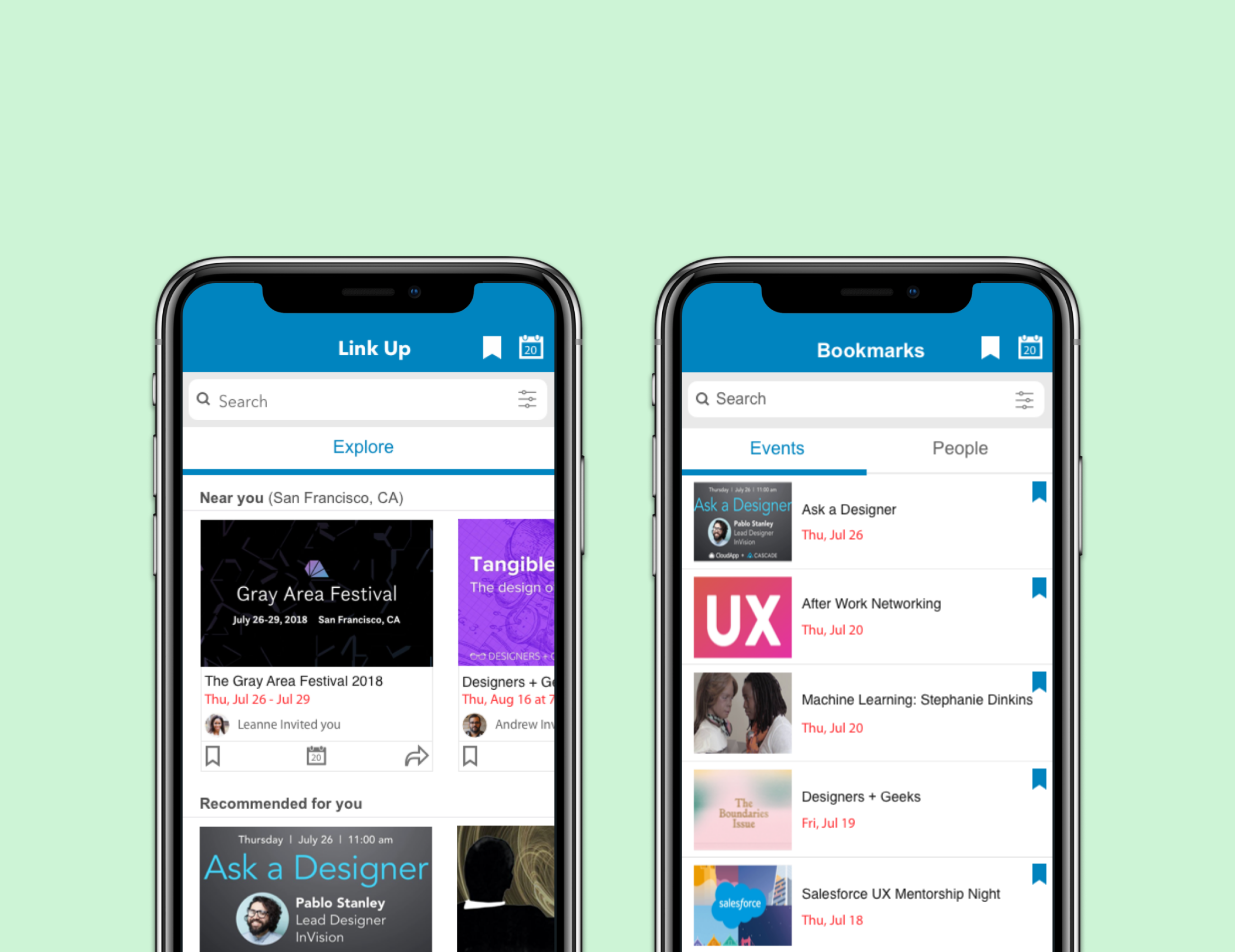
We designed Link Up — a new feature that provides users with local networking events and an efficient contact management system to organize memorable data from events and networking — all while keeping job opportunities front and center.
Our process spanned design thinking, early-to-end-stage wireframing, usability testing, and interactive prototyping.
Final Designs
The final hi-fidelity designs maintain LinkedIn's existing look and feel while introducing four key new screens for the Link Up feature.
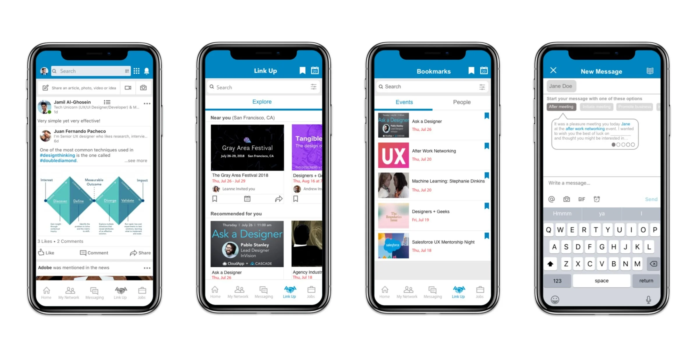
Four core screens: the existing LinkedIn home feed, the new Link Up events explorer, the Bookmarks tab, and the guided New Message flow.
Research
Competitor Analysis
There are no apps that fully combine job searching with networking event discovery, so we compared features across the closest competitors to identify gaps and opportunities.
| Feature | Meetup | Shapr | Slack | |
|---|---|---|---|---|
| Interests section | ✓ | ✓ | ✓ | – |
| Search bar | ✓ | ✓ | – | ✓ |
| Messages log | ✓ | – | ✓ | ✓ |
| Profile page | ✓ | ✓ | ✓ | ✓ |
| Job search feature | ✓ | ✓ | – | – |
| Networking | – | ✓ | ✓ | ✓ |
| Meet IRL functionality | – | ✓ | ✓ | – |
| Suggested connections | ✓ | ✓ | ✓ | – |
| Groups / Orgs | ✓ | ✓ | – | ✓ |
| Events | – | ✓ | – | – |
| Reminders | – | ✓ | ✓ | – |
Key opportunity: All three comparative apps had profiles and networking features, but LinkedIn was uniquely missing event discovery, IRL meet-up tools, and reminders — all highly consistent features in networking-focused apps.
User Interviews
We sent out screen surveys and conducted 28 survey responses and 9 in-person interviews (1–2 hours each) with individuals ranging from 20–48 years old.

Affinity mapping session to synthesize user interview findings.
What users told us
"There's a pressure to stand out at networking events."
Feelings about attending networking events"I usually try to find a common ground or mention mutual connections."
Approaching someone at a professional event"I prefer having 1:1 meetings or going to mixers vs phone or video calls."
Preferred type of networking"I flag important emails, make notes and update my calendar regularly!"
Organizing networking and professional notesDefine
Problem & Solution
Problem
Users need to network with individuals in their desired community but lack guidance in approaching the right professionals and keeping their contacts properly organized after events.
Solution
Link Up enables users to reach out to working professionals with guided message prompts and organize their notes and bookmarks — all within a single LinkedIn feature.
Personas
To ground our designs in real user behavior, we created three personas from our research findings. The primary persona is Daniel, the ambitious networker, who guided the rest of our design journey. We also created Lynn (the nervous networker) and Steve (the charismatic career coach).
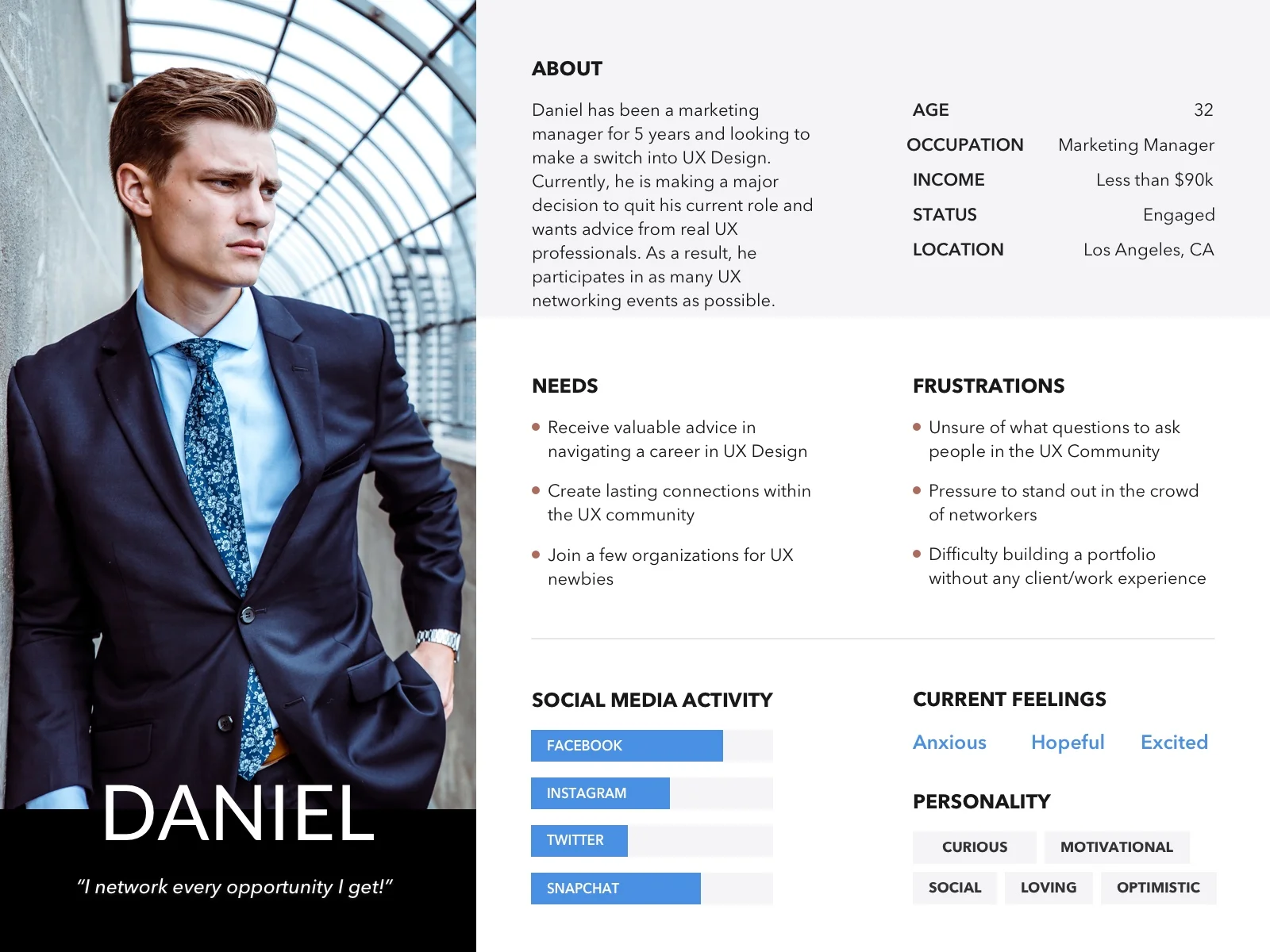
Primary persona, the ambitious networker
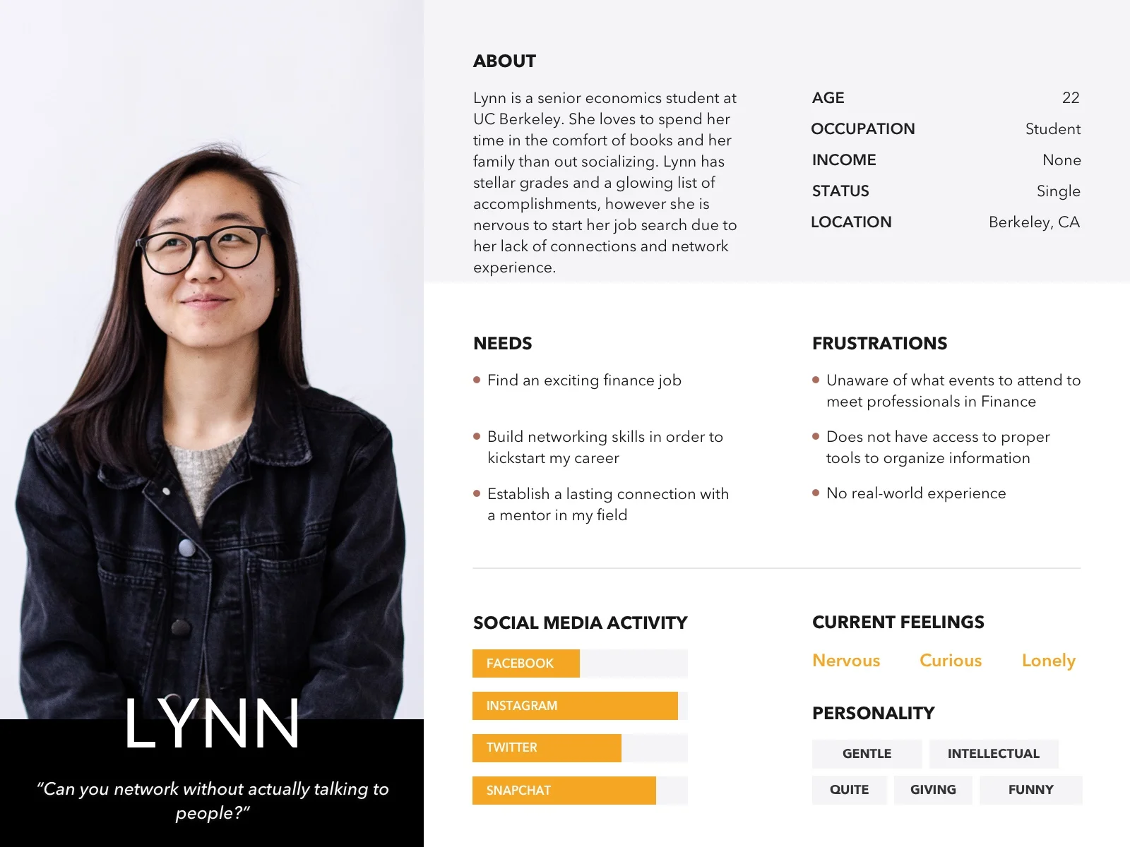
Secondary persona, the nervous networker
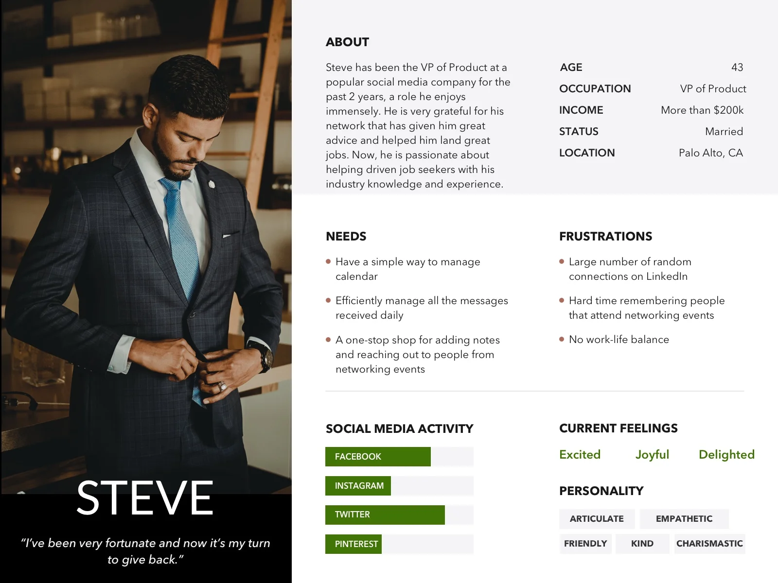
Special persona, the charismatic career coach
Storyboard & User Flows
A storyboard traced Daniel's journey from attending a networking event, to connecting with a professional he met there, to eventually landing his dream job through the Link Up feature.
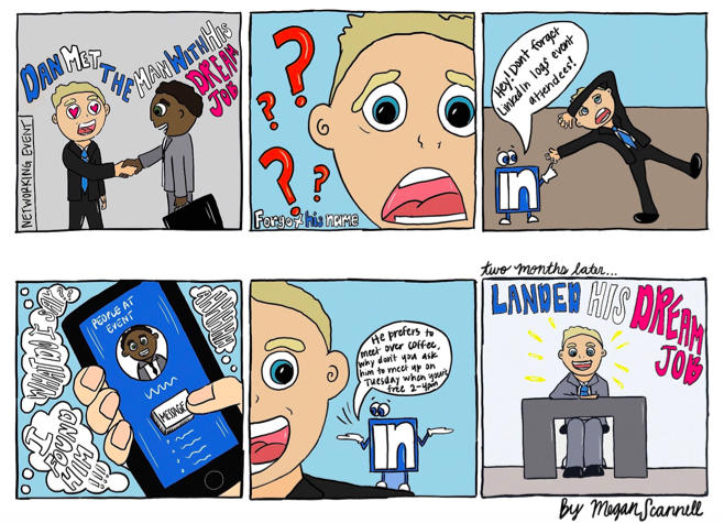
Illustrated storyboard by Megan Scannell depicting Daniel's full journey.
We mapped two primary user flows to guide our wireframing:
User Flow 1
Finding a member from a past networking event and messaging them through a guided prompt.
User Flow 2
Finding bookmarked people and events.
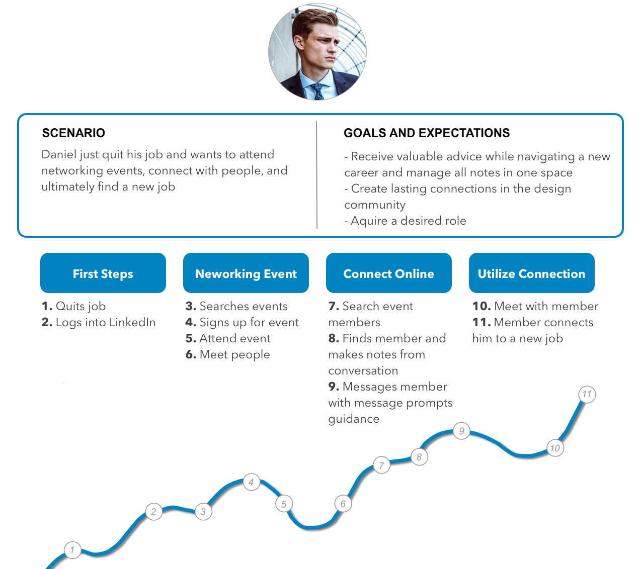
Daniel's journey map showing the 11-step flow from quitting his job to landing a new role through Link Up.
Wireframes & Iterations
Hand sketching ideas and screens provided for multiple iterations based on initial usability testing. This helped us sketch our user flows, journey map, and storyboard before moving into digital wireframes.
Sketches
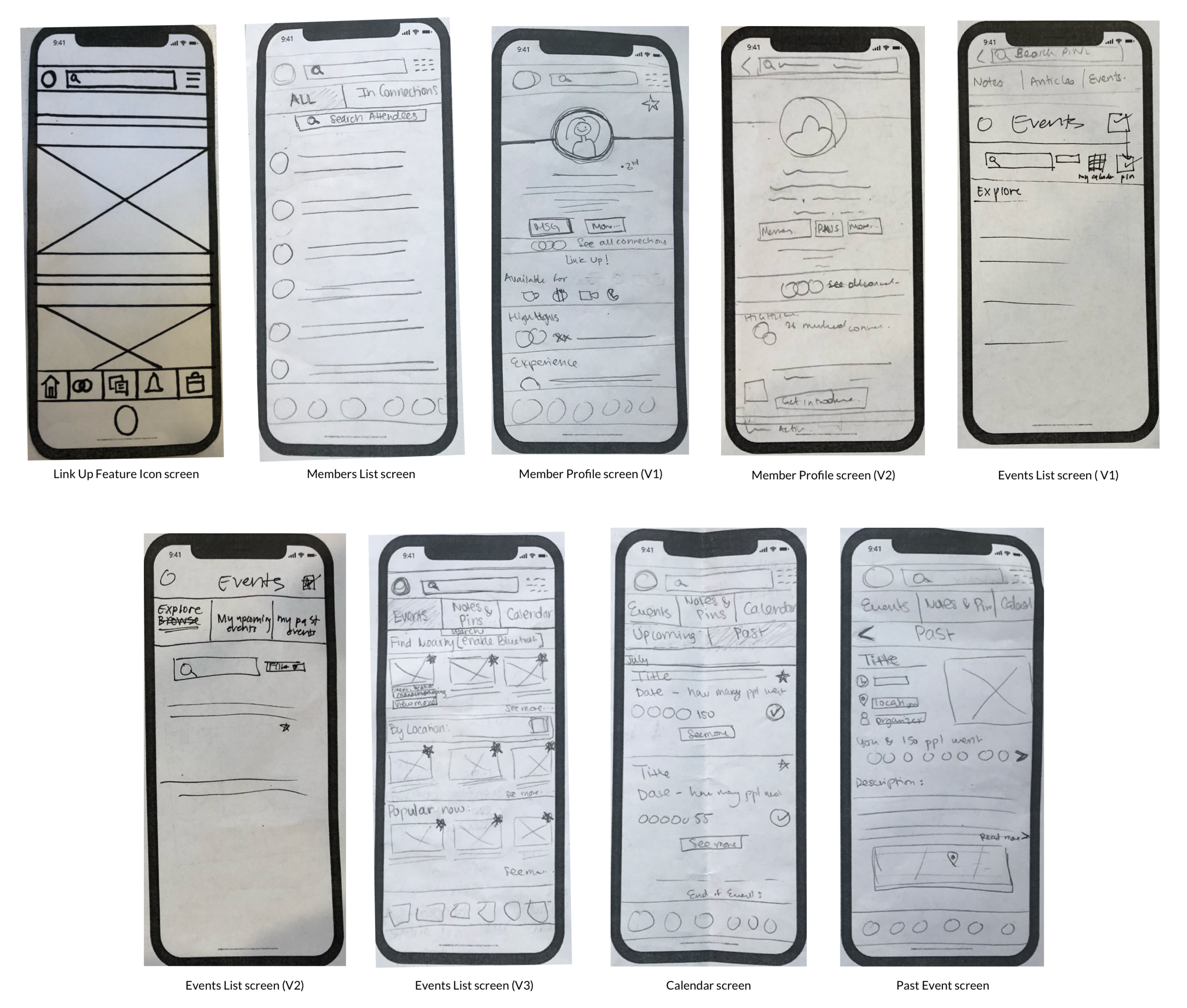
Hand sketches of core screens across multiple versions.
Lo/Mid-Fi → Hi-Fi Wireframes
Once we sketched the new feature on paper, I took sole ownership of creating the Lo/Mid-Fidelity wireframes and converting them into a clickable prototype to start testing immediately.
Messaging User Flow — Lo/Mid-Fi to Hi-Fi
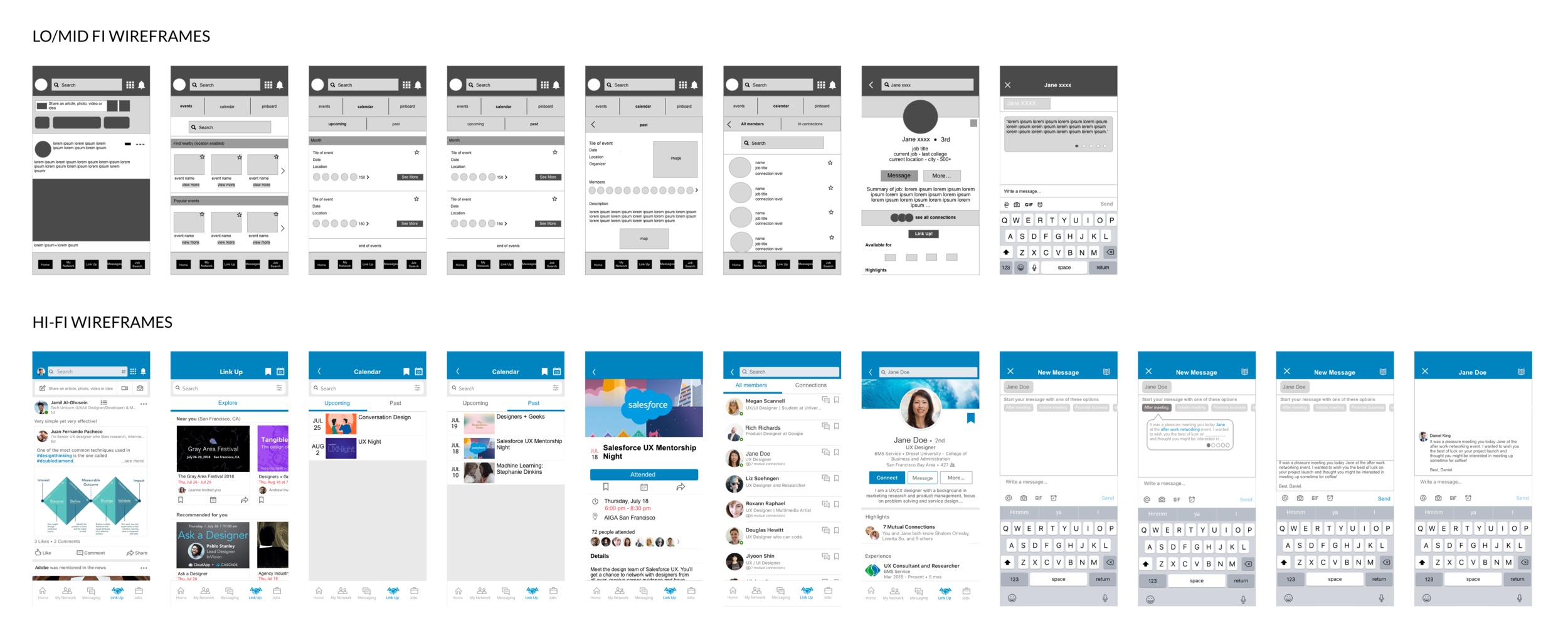
Iterated screens for the messaging user flow, from lo-fi to hi-fi wireframes.
Bookmarking User Flow — Lo/Mid-Fi to Hi-Fi
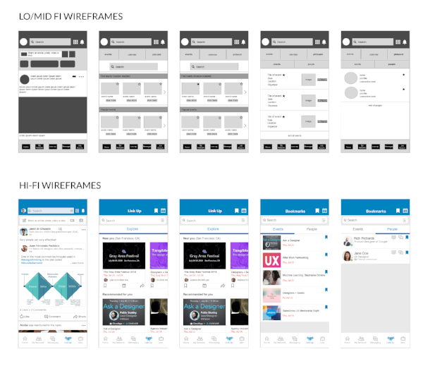
Iterated screens for the bookmarking user flow, from lo-fi to hi-fi wireframes.
Notes Feature — Hi-Fi Wireframes
Hi-fi wireframes for the bonus Notes feature — private per-contact notes visible only to the user.
Usability Testing
Each phase of usability testing proved immensely valuable because it defined what our users found delightful, painful, and worth improving.
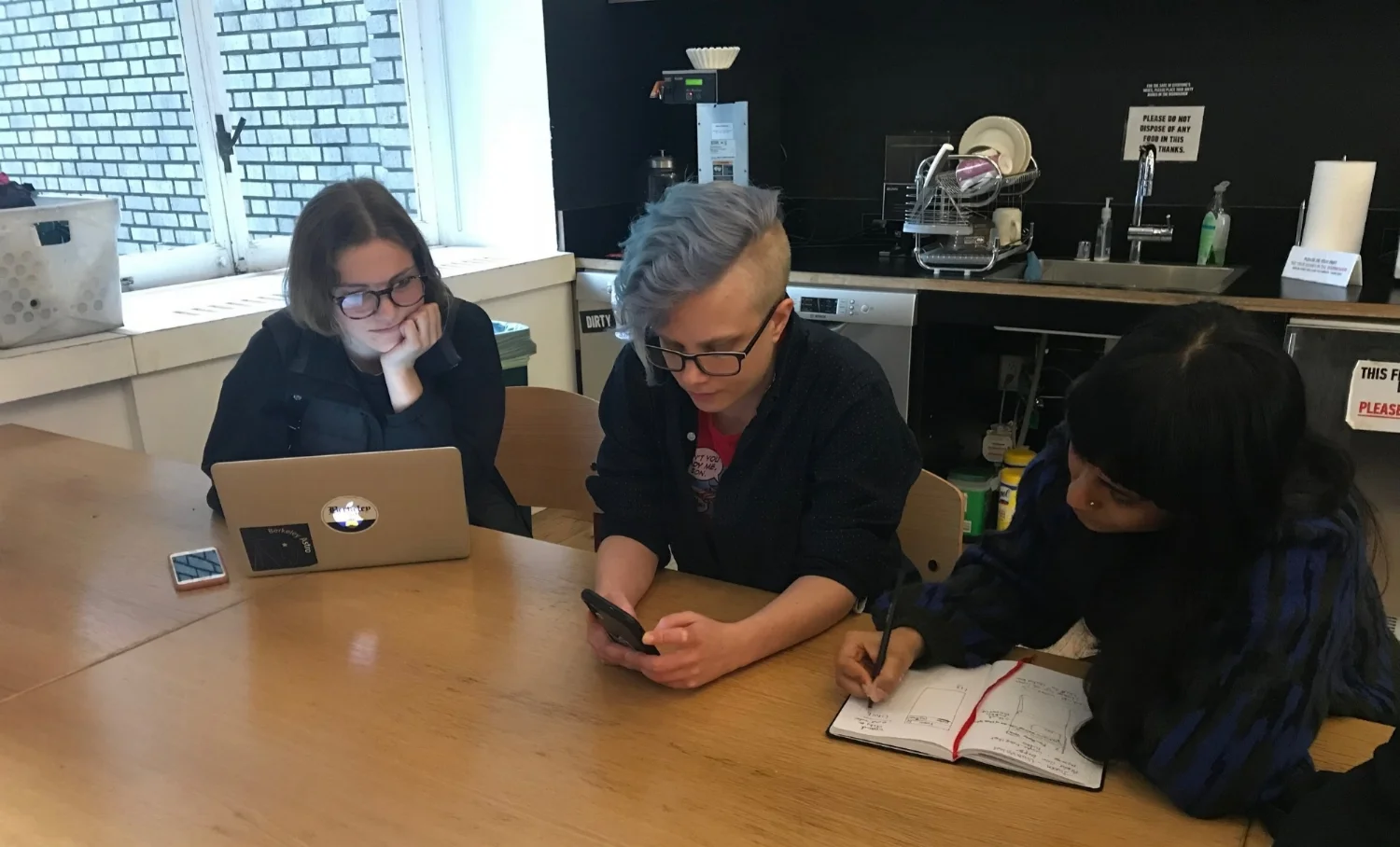
In-person usability testing sessions.
"This is something I've always wanted on LinkedIn... and the notes addition is a perfect touch to remembering key moments."
— An Avid LinkedIn User
Round 1 — Lo/Mid-Fi Prototype
Likes
- Guided prompt feature
- Bookmarking ability
- Pinboard page
- Events page
Wants
- Calendar and list view
- Ability to reference notes in messages
- Personalize names with "My"
Round 2 — Hi-Fi Prototype
Likes
- Design brand staying true to LinkedIn
- Guided prompts
- Ability to find attendees from past events
- Notes feature
Wants
- Add an "Upcoming" and "Past" events tab side-by-side, separate from the "Explore" tab
- Simpler flow navigating from adding notes to messaging a member
Interactive Prototypes
Three total prototypes were built. Below are two final prototypes for a messaging flow and a full combined experience (including messaging).
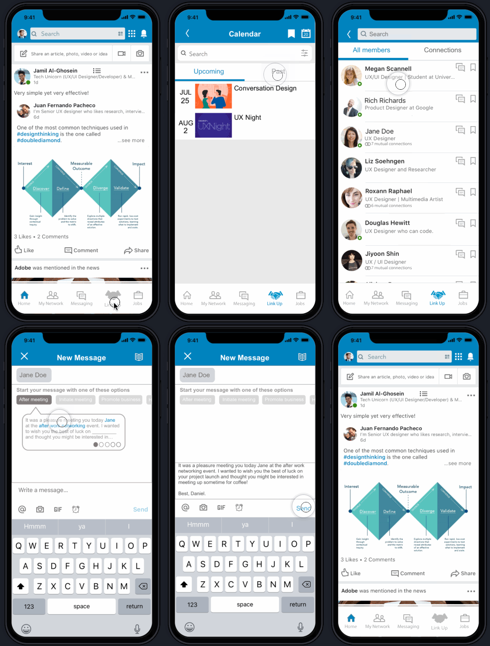
Prototype showing before/after: bottom nav without Link Up vs. with Link Up tab added.
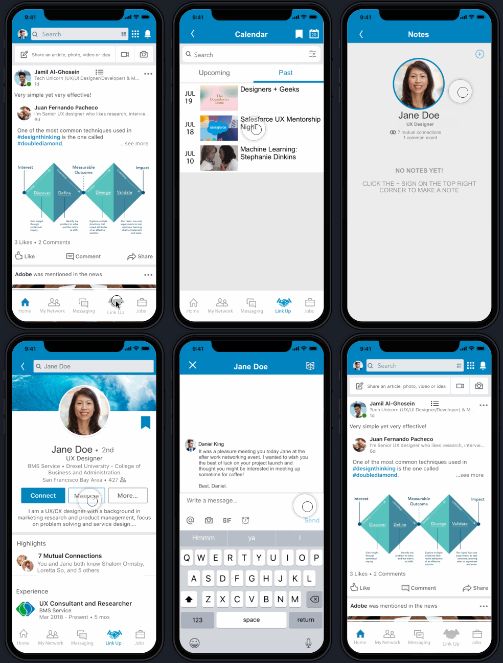
Full user flow combining bookmarking, notes, and reminder feature in a single prototype.
Reflection & Next Steps
Before the project began, my team and I felt extremely driven — we were all avid LinkedIn users and could see the opportunity clearly. A few days in, we immediately recognized that keeping the look, brand, and feel of LinkedIn throughout the whole process was genuinely challenging due to creative constraints. However, the reaction we gained from users was overwhelmingly positive, and many were hopeful to see this feature take off in the future.
This project was a formative one for me — it was my first experience leading project management alongside design, which sharpened how I think about scoping, delegating, and keeping a team aligned. Conducting user interviews and synthesizing them into a primary persona gave me a much stronger instinct for grounding design decisions in real human behavior rather than assumptions.
Next Steps
For a future iteration, the Notes tab would benefit from allowing users to rearrange notes in different styles according to their preference — such as list view, word clouds, or the default "tree branches" style — making the contact management experience feel more personal and flexible.
Concept project — all designs are original work created for portfolio and learning purposes.