
Redesigning the online shopping experience for a local SF boutique
A solo UX/UI project to redesign the e-commerce website of Current Clothing — a contemporary clothing boutique in San Francisco's Marina district — improving navigation, discoverability, and the path to purchase.
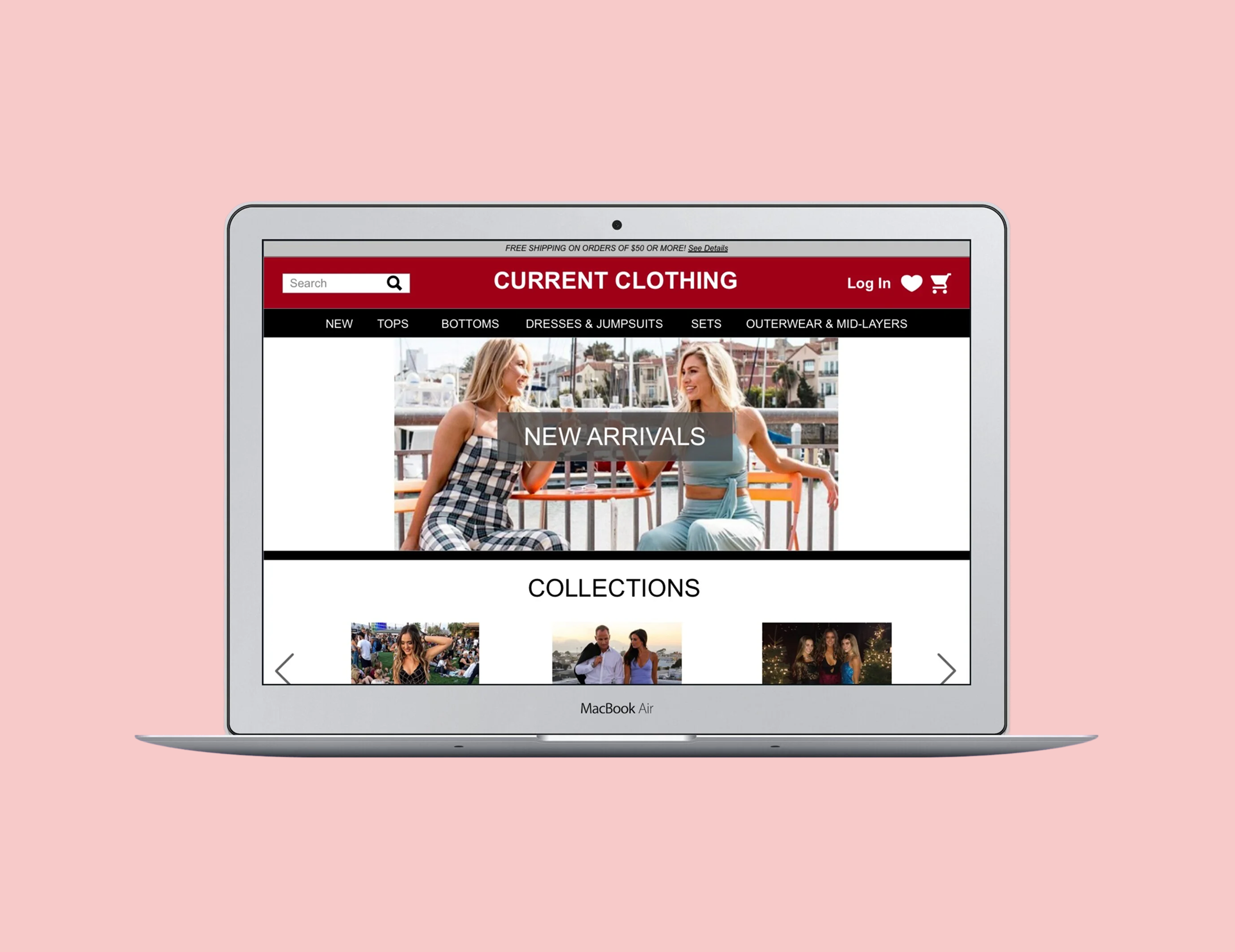
Overview
Current Clothing is a local contemporary clothing boutique located in the Marina district of San Francisco, California. Founded in 2014, the boutique mainly advertises its products through Instagram and keeps a low-profile on its official website.
Unfortunately, the lack of attention on their site shows through: unclear navigation, a cluttered homepage, no filters for products, and no promotions or sales content — leaving a gap between how great the in-store experience is and what customers find online.
Design Challenge
Redesign the e-commerce website of a local boutique in San Francisco so that customers can discover, filter, and purchase clothing online with the same ease they'd find in-store.
Style Guide
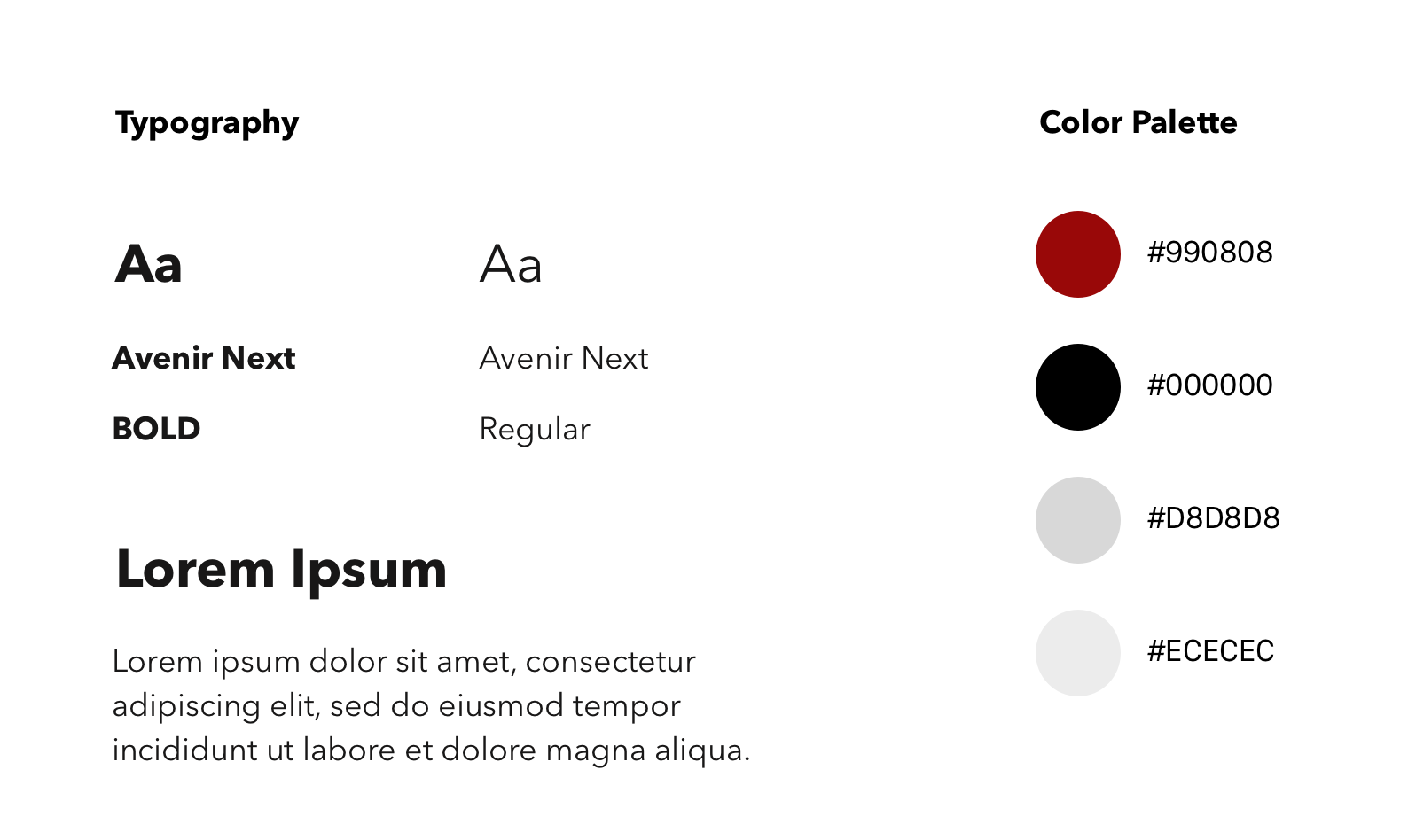
The redesign preserved the boutique's existing brand identity — a bold crimson red paired with clean black and white. Typography used Avenir Next in bold for headings and regular weight for body copy, keeping the aesthetic modern and minimal.
Research
Who are the competitors?
Current Clothing prides itself on staying open later than other boutiques in the neighborhood. But staying open longer isn't enough when competing online. To understand what strategies successful contemporary e-commerce sites were using, I looked at two key competitors: GAP and Urban Outfitters.

What both GAP & Urban Outfitters do well
- Clear navigation bar with dropdown features for each category
- Prominent, visible search bar
- Highlighted brand logo front and center
- Minimalistic overall design
- Wishlist / Loves List functionality
Where Current Clothing fell behind
- Navigation was unclear with no dropdown subcategories
- Homepage felt cluttered with no clear hierarchy
- No filters on product pages (size, price, color)
- No promotions, sales banners, or featured collections
- Logo hard to find; brand presence felt weak online
User Interviews & Findings
To understand the boutique's culture and customer base firsthand, I visited the store. There I met Bailey — the store manager — and observed and spoke with several shoppers during my visit. This contextual inquiry gave me a grounded view of who actually shops at Current Clothing and why.
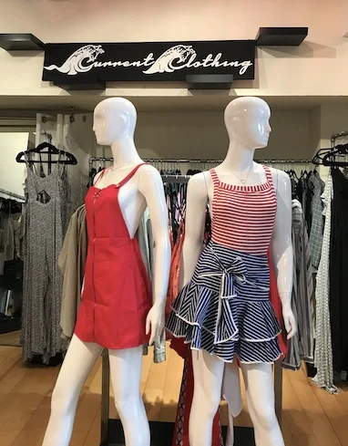
Many women come in for wedding-guest dresses and music festival wear — two distinct needs the site wasn't serving at all.
Key findings from user interviews & contextual inquiry
Demographics are 95% women
Most shoppers are local to the Marina neighborhood — they discover the store by walking by
More foot traffic in the evenings — the store's extended hours are a real differentiator
Less than half the people who visit leave with a purchase — browsing is common, conversion is low
A significant segment shops for wedding-guest dresses and music festival wear — two occasion-driven categories not reflected in the current site
Define
Personas
Interviewing shoppers and the store manager gave me a clear picture of who shops at Current Clothing. I created three personas — Lauren is the primary, grounding every design decision in her real needs as a local, neighborhood-first shopper.

Marina District, San Francisco
Goal: Browse in-store, then buy online later at her convenience.
Pain point: Inconvenient to travel far just to check something out before buying online.

Mission District, San Francisco
Goal: Find creative, affordable festival outfits online fast.
Pain point: Hard to find festival-style clothing that's affordable and unique.

Noe Valley, San Francisco
Goal: Find a contemporary wedding-guest dress that's fun yet occasion-appropriate.
Pain point: Hard to find dresses elsewhere that feel unique and carefree.
Problem & Solution
Problem
Users find themselves frustrated and wasting time because they're unable to find clothes in their size and price range — the site lacks basic filter features to narrow down product options.
Solution
Add a robust filter system to product pages so users can search by size, price, and color — decreasing frustration, reducing time-to-find, and ultimately growing sales for the boutique.
Information Architecture
I compared Current Clothing's IA for the navigation bar with two other contemporary clothing e-commerce sites: GAP and URBAN OUTFITTERS.


After comparing Current Clothing's navigation with GAP and Urban Outfitters, it was clear the site needed a restructured information architecture.
Card Sorting
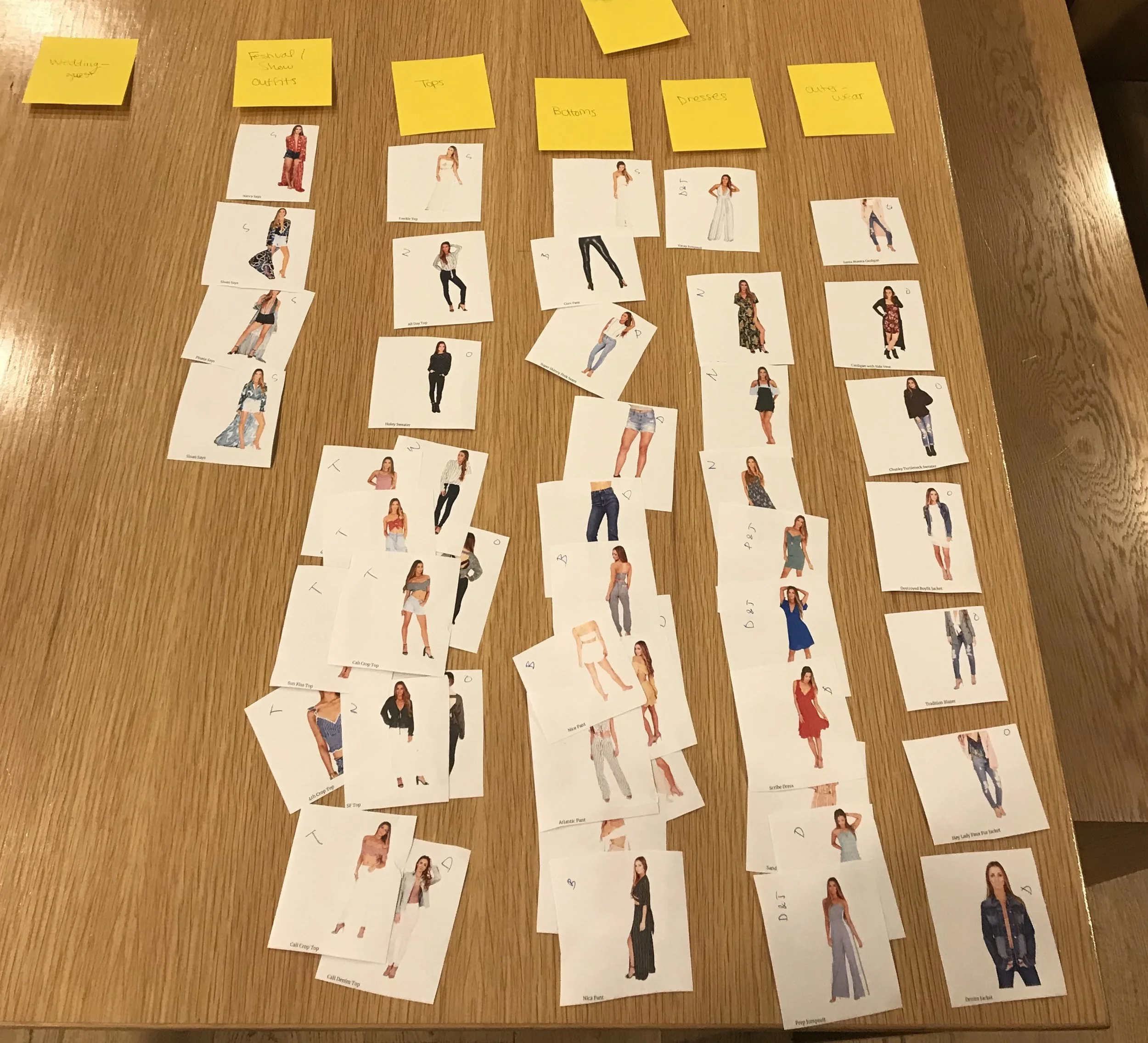
I conducted card sorting with users — sorting printed clothing images into categories — to understand their mental models for how products should be grouped.
The result: a flatter, cleaner sitemap with dropdown subcategories under each main nav item, replacing the original cluttered top-level structure with something users could actually navigate.
Sitemap
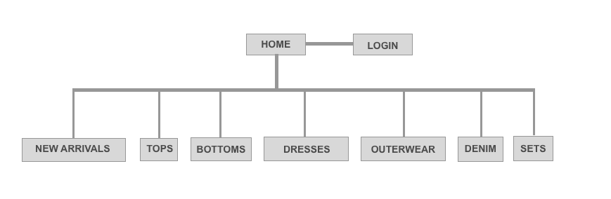
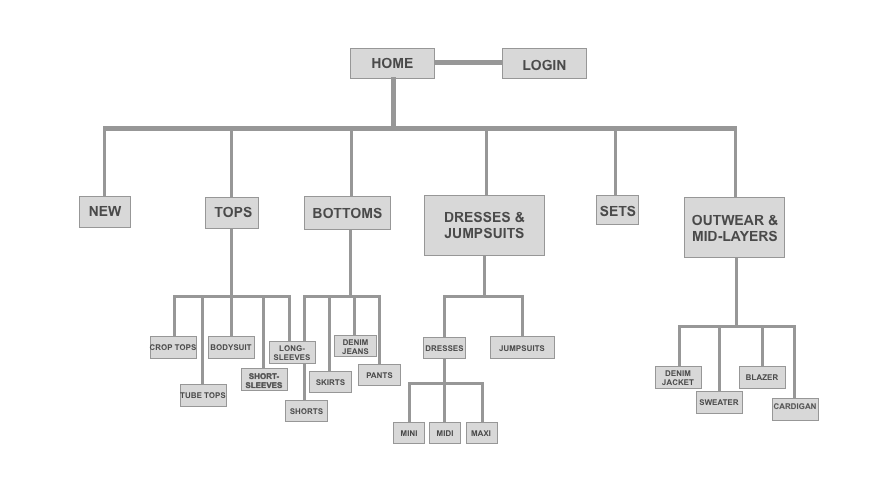
Old sitemap
- Flat navigation — no dropdowns
- Overly granular top-level categories (e.g. "Dresses & Jumpsuits", "Outerwear & Mid-Layers")
- No subcategory hierarchy — all items dumped at the same level
New sitemap
- Streamlined top-level nav: New Arrivals, Tops, Bottoms, Dresses, Outerwear, Denim, Sets
- Dropdown menus under each category with subcategory filters
- Mirrors the mental models users demonstrated in card sorting
Design
Sketches & Wireframes
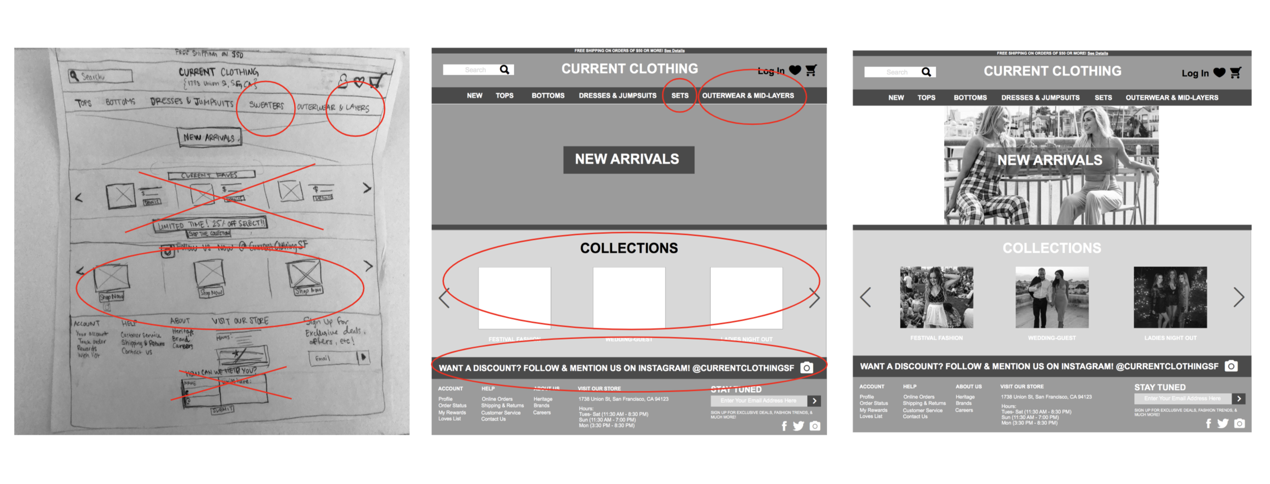
Before going digital, I hand-sketched the redesign for Current Clothing's homepage, then built low-fidelity block wireframes, and finally progressed to high-fidelity wireframes. Each stage was compared against the original to validate improvements.
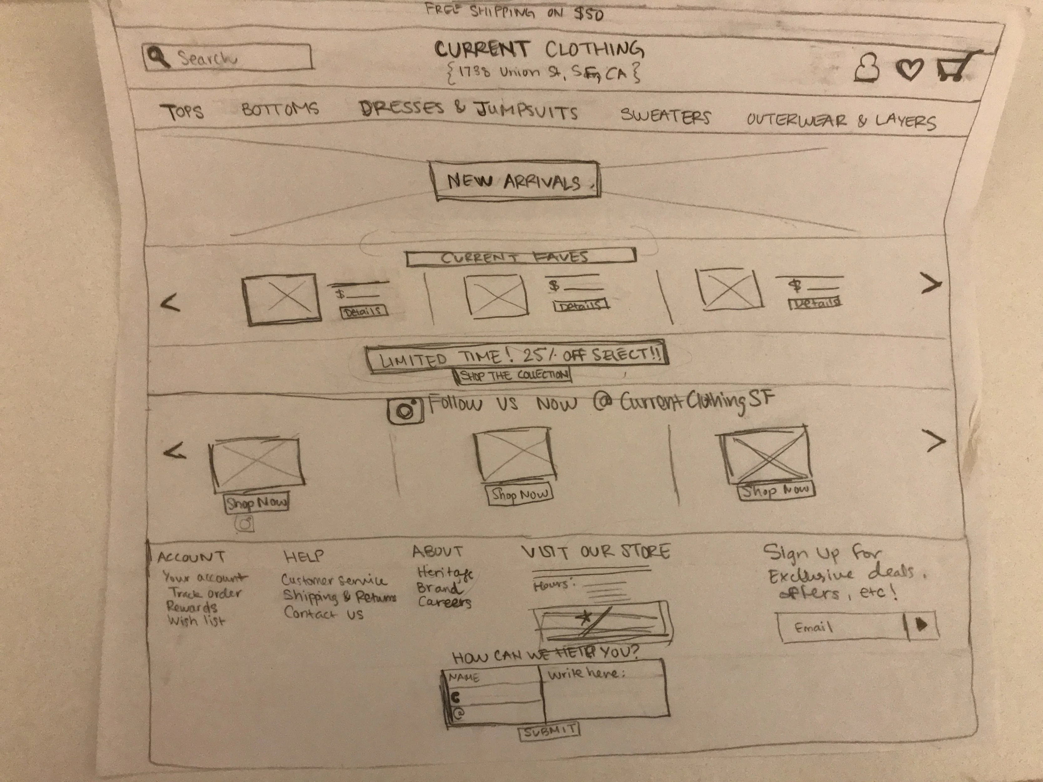
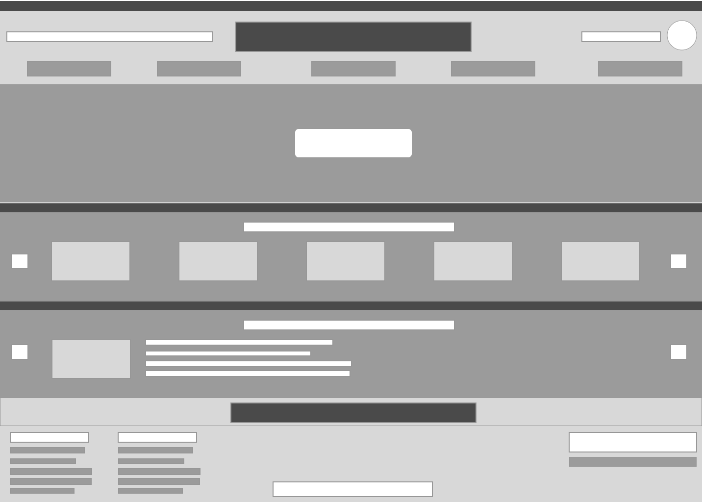
Homepage
The homepage redesign focused on establishing a clear visual hierarchy: a hero banner for new arrivals up top, a curated collections carousel below, and an Instagram CTA strip at the bottom to bridge the gap between their social and web presence.
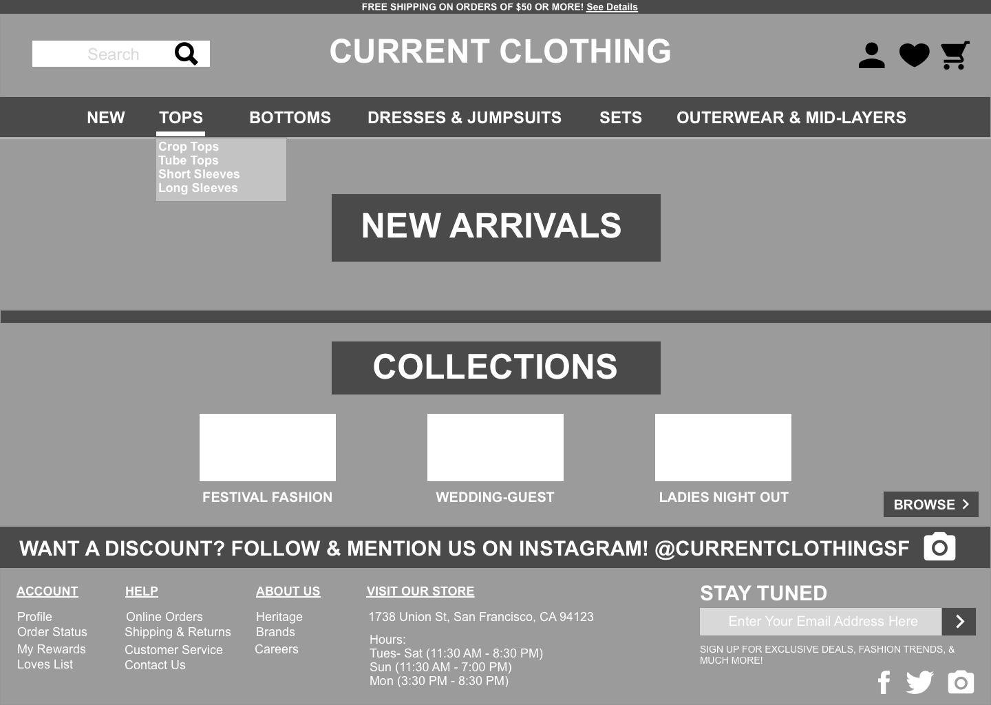
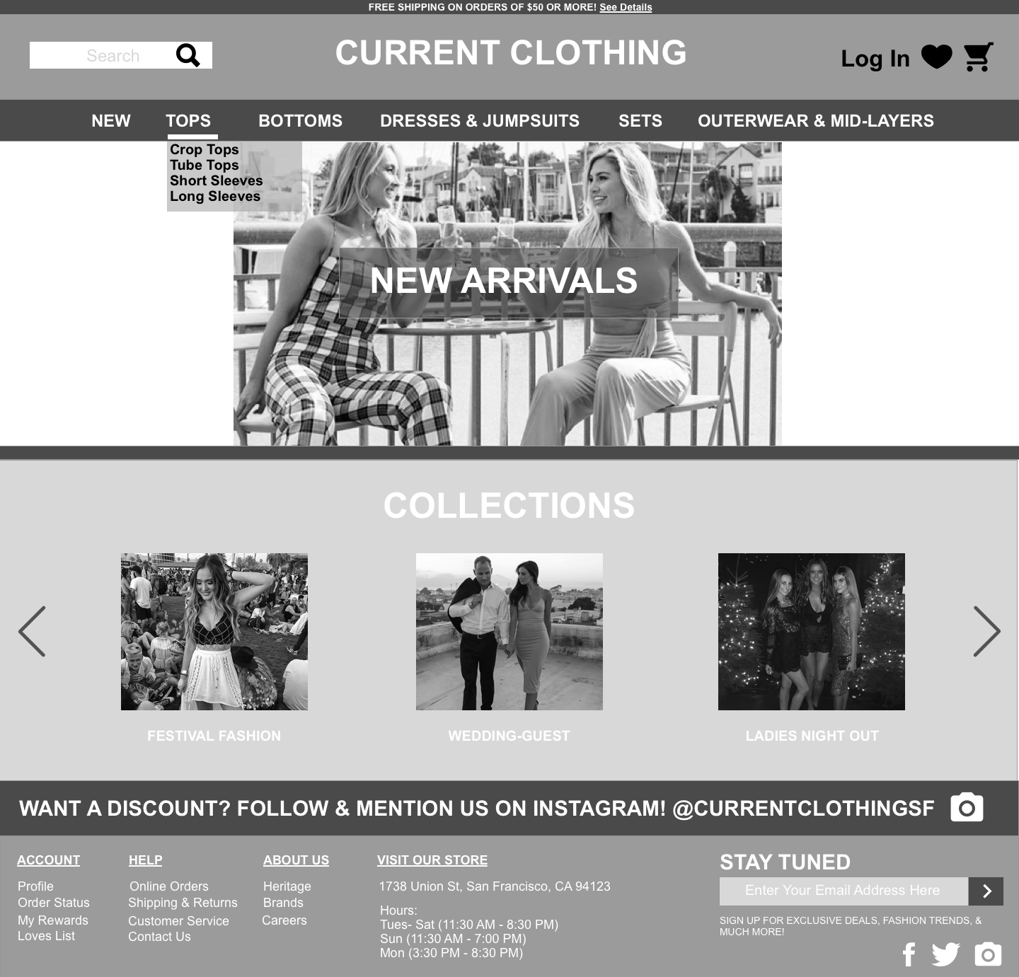
Navigation — added dropdown menus with subcategories
The original nav had no subcategories, making it hard to find specific product types. Card sorting confirmed users expected dropdown menus — matching what they see on GAP and Urban Outfitters.
- Each nav item now expands to reveal subcategories (e.g. Tops → Crop Tops, Tube Tops, Short Sleeves, Long Sleeves)
- Log In button and Cart icon clearly placed in the top-right
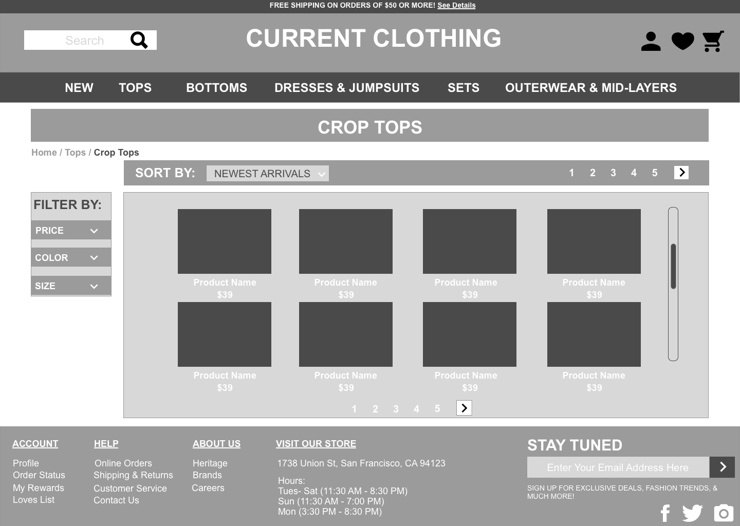
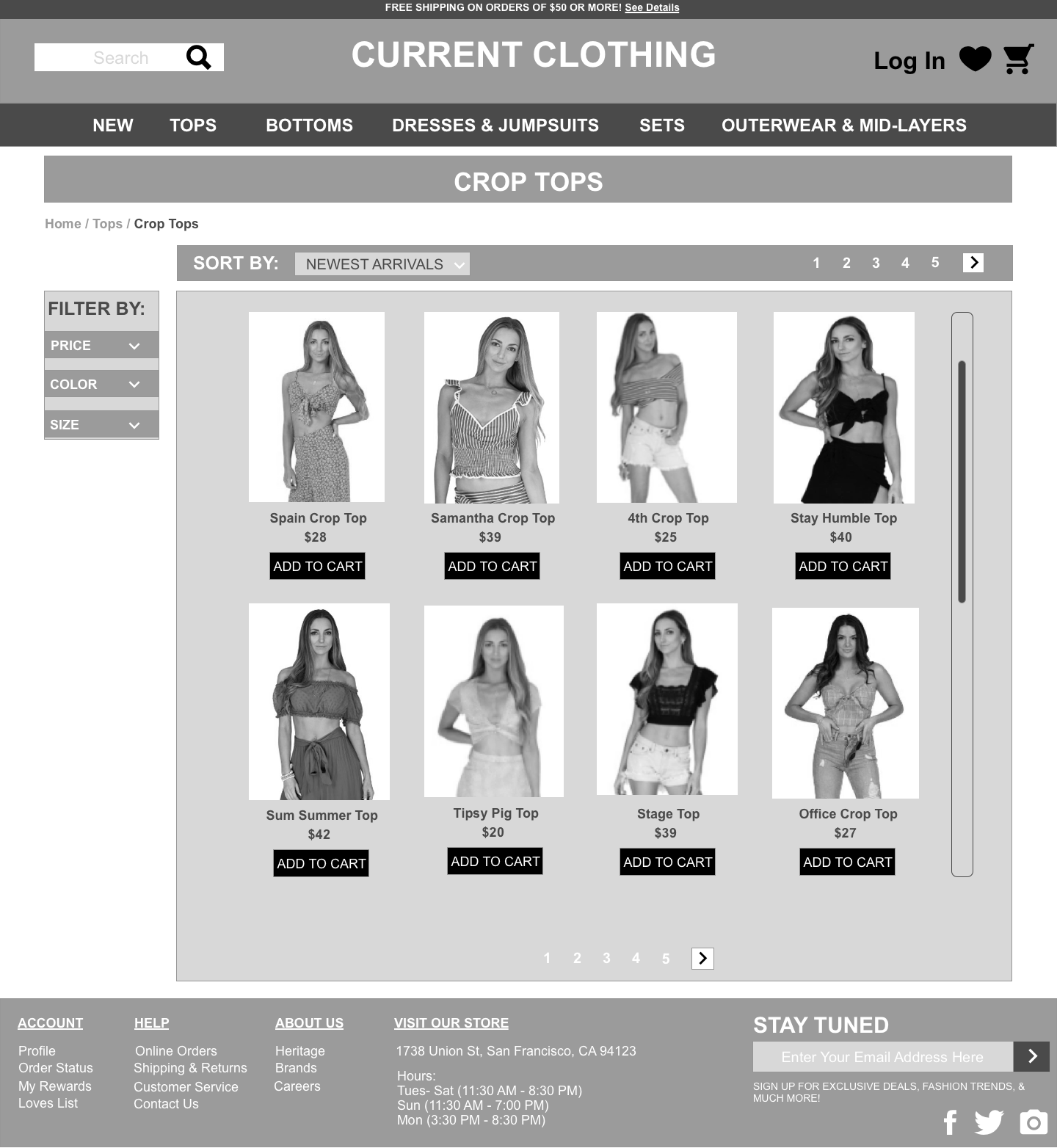
Products page — added filter panel for size, price, and color
The original products page had no filtering at all — users had to scroll through every item to find something in their size and budget. This was the single biggest frustration uncovered in research.
- Left-rail filter panel with Price, Color, and Size filters
- Sort-by dropdown added at the top (Newest Arrivals default)
- Product cards show image, name, price, and "Add to Cart" — cleaner than the original
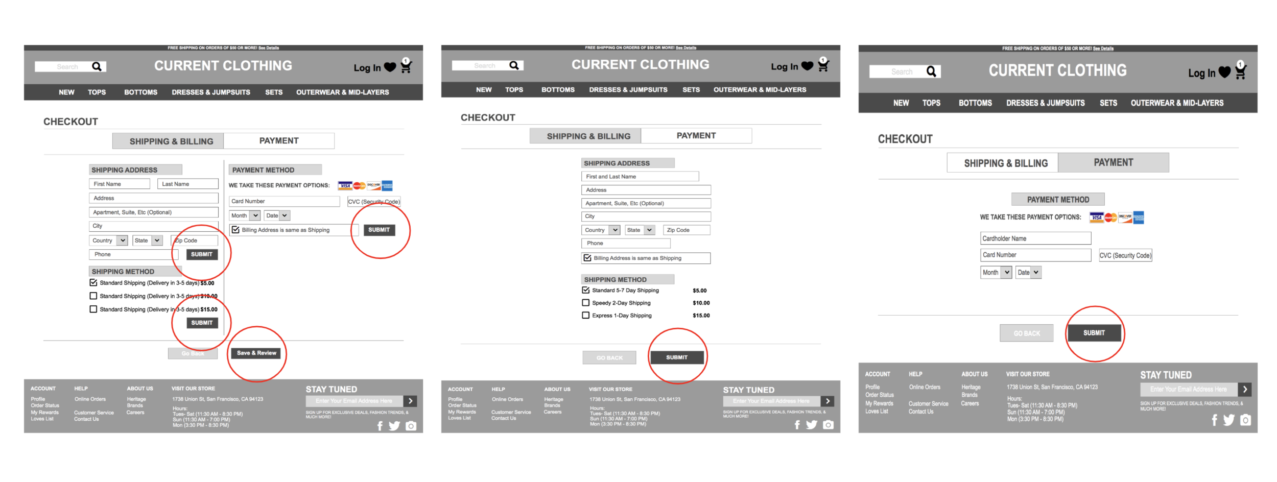
Checkout — simplified shipping & payment into one clear flow
The original checkout showed Shipping and Payment simultaneously, which was confusing. Users expected a step-by-step process where they complete one stage before moving to the next.
- Tabbed checkout: "Shipping & Billing" → "Payment" as two clear sequential steps
- Shipping options display real cost estimates (Standard, Express, Overnight)
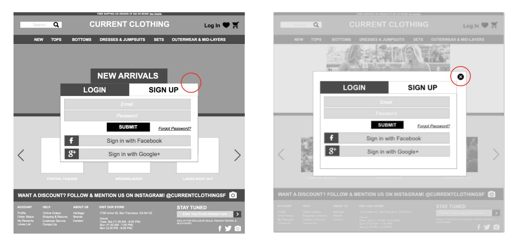
Account login — added exit button & guest checkout
The original login page had no way to exit or skip account creation — a conversion killer. Users shouldn't have to create an account to make a purchase.
- Added a clear "×" exit button so users can return to browsing at any time
- Login and Sign Up as two distinct tabs — not stacked on one screen
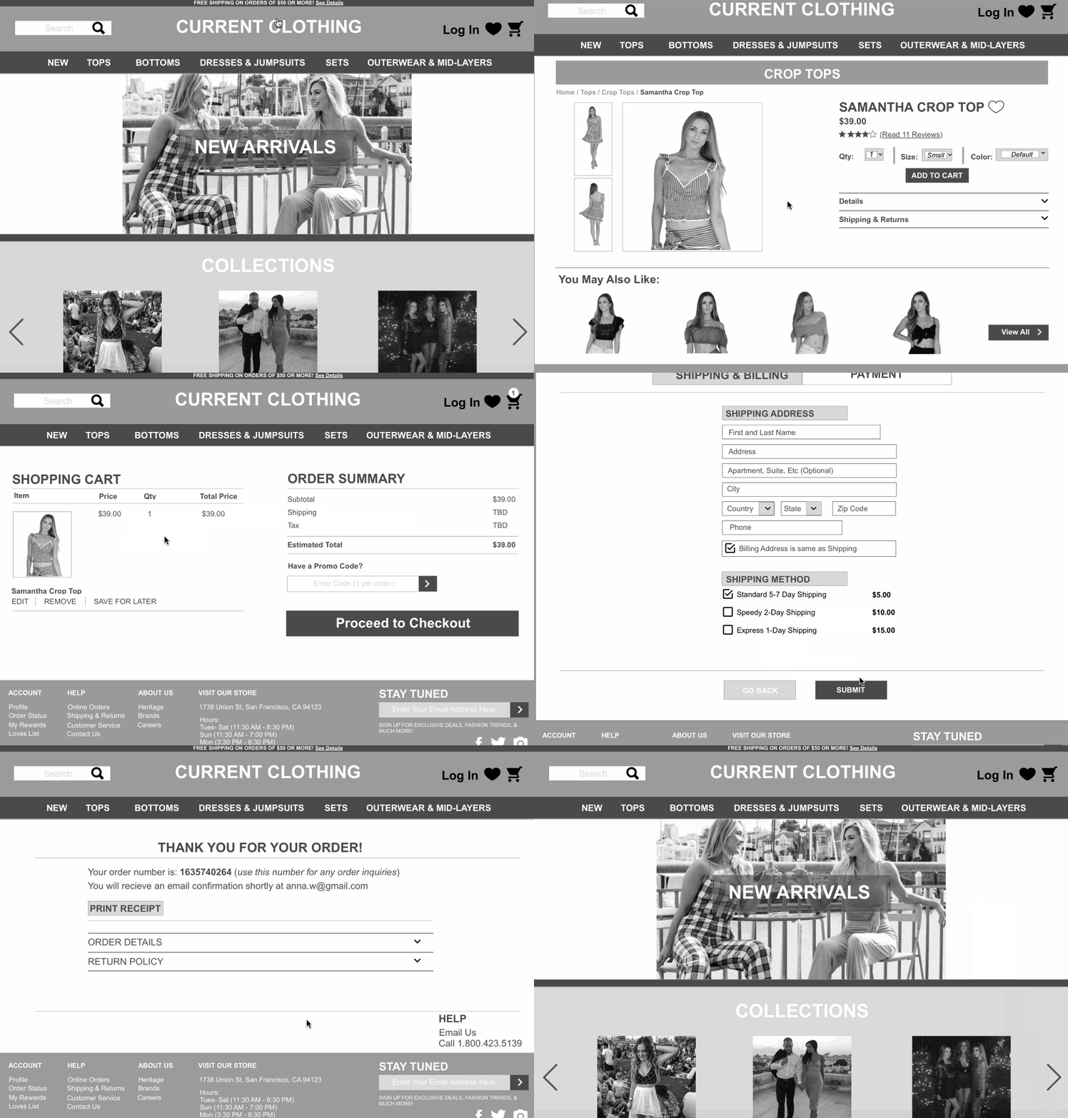
Interactive Prototype
The final hi-fidelity InVision prototype demonstrated a clear end-to-end user flow. See below for the primary flow and the hi-fidelity prototype.
Reflection & Next Steps
This redesign reinforced how important it is for e-commerce sites to authentically reflect their target audience. Current Clothing had a wonderful in-store experience — warm, local, community-driven — but their website didn't communicate any of that. Being a small boutique means many customers discovered the store by walking by or through Instagram; translating that serendipitous, neighborhood feel into a digital experience was the real design challenge.
The gap between in-store conversion (less than 50%) and potential online sales was significant — and solvable. Filtering, clearer navigation, and a streamlined checkout are foundational steps that could meaningfully close that gap.
Next Steps
A small boutique with a big community — this project reminded me that the best e-commerce design doesn't just sell products. It captures the feeling of walking into a store you love and makes it easy to come back.